.png)
One of the pivotal inspirations behind TargetBoard emerged from an experience at a highly successful tech unicorn, known for its data-centric product where integrity and reliability are foundational. Our casual discovery of a critical metric being off by 90% set the stage for our venture. This discrepancy went unnoticed within the organization, and even after we rectified the issue, there was no subsequent initiative to probe whether other key performance indicators (KPIs) were similarly misaligned.
Data is the backbone of decision-making. We rely on it not just for strategic decisions but for daily operational choices as well. However, once KPIs are set, it’s rare for them to be revisited or audited for accuracy. This oversight can lead to significant misjudgments, based on distorted data views that everyone assumes are correct.
This very unicorn, now a TargetBoard client, represents a full-circle moment for us. With our platform, they uncovered several additional KPIs needing recalibration. The initial setup of these metrics no longer reflected the current realities of their business, illustrating a common challenge in the dynamic tech landscape.
Data teams are often stretched thin, focusing on maintaining the continuous flow of data while struggling with outdated tools that fail to support effective data management. This is where TargetBoard steps in, providing a robust solution that not only presents data vividly but also insists on its accuracy, making it impossible to ignore. As one customer put it, “I love how you guys are putting the data in my face, making it so I can’t ignore what I’m seeing.
”While some organizations may prefer the proverbial “ostrich approach” of ignoring potential issues, TargetBoard is designed for those who prioritize responsiveness and informed action. Our platform adds a critical layer of verification to your data processes, ensuring the KPIs you depend on reflect the true state of affairs.
In the fast-paced, ever-evolving world of tech, the ability to trust your data and react swiftly to its insights is not just an advantage—it's a necessity. TargetBoard makes this not only possible but also seamless and affordable. For organizations looking to ensure their data truly represents their operational reality, TargetBoard is an indispensable ally.
Join us in empowering your data oversight. With TargetBoard, watch your back by watching your data with the vigilance it deserves.
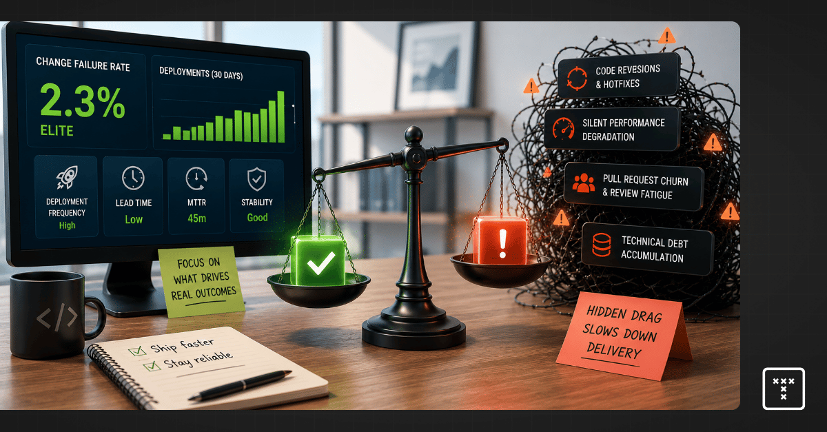
Change failure rate (CFR) measures the percentage of code deployments that result in a failure in production. The goal is to track how often your team pushes code that requires immediate remediation.
This metric serves as a critical counterbalance to deployment frequency. Optimizing strictly for speed often damages quality, so tracking failures ensures your team maintains system stability while shipping features faster. Engineering leaders use this DORA change failure rate signal to balance the inevitable tradeoff between quality versus speed.
Calculating this metric requires standardizing what counts as a deployment and what counts as a failure. You must define these terms consistently across your incident response tools and code repositories.
To calculate change failure rate, use this formula:
(Number of Failed Changes / Total Number of Changes) × 100
Industry benchmarks categorize engineering teams into performance tiers based on their ability to ship code reliably. According to the 2023 Accelerate State of DevOps Report by Google Cloud, you can measure change failure rate against these established standards to gauge your baseline delivery health.
Most engineering leaders limit the definition of failure strictly to hotfixes and rollbacks. This narrow scope misses the broader picture of system degradation.
If a deployment introduces massive technical debt or causes degraded service that doesn't trigger a critical alert, your dashboard will still show a success. This forces leaders to rely on intuition because incomplete data undermines the credibility of engineering reporting. Redefining failure for the modern era means looking at the entire workflow rather than just the final production state to capture the true cost of service patches.
Modern software delivery systems experience friction long before a catastrophic outage occurs. You must expand your definition of failure to capture the hidden costs of code delivery.
A dashboard can easily show an Elite status while your team is actually dealing with high pull request churn. This happens when teams game the metric or pollute the data with inconsistent definitions.
One common mistake is including fix-only deployments in the denominator of your calculation. If you push five hotfixes to resolve a single incident, counting those fixes as new deployments artificially lowers your failure rate. Another pitfall involves poor incident attribution, where third-party cloud outages are counted against internal team performance. These practices create a false sense of stability that operational intelligence must correct to restore trust in your reporting.
Executives must ensure their teams map incidents accurately across the software delivery lifecycle. Messy data makes it impossible to identify root causes and delays critical decision-making.
The rapid adoption of AI coding tools fundamentally changes how we measure delivery risk. These tools drastically increase developer output, so teams write and submit code faster than ever before. Yet this sheer volume of artificial intelligence-generated code contributions introduces unseen complexity into your repositories.
Downstream reviewers simply can't keep up with the flood of new pull requests. This imbalance creates severe review fatigue, where engineers lose the capacity to deeply inspect code for architectural flaws or long-term maintainability issues. The code compiles and passes basic tests, but the underlying structural health of the system degrades quietly.
Unmanaged complexity builds up in your repositories and creates massive workflow friction during the review stage. When a dense, highly complex pull request sits in review for days, engineers eventually rubber-stamp the approval just to clear their queues.
That code merges, sits in the pipeline, and fails days later in production. You then spend valuable engineering cycles on bug prioritization instead of shipping new features. The failure looks like a sudden event on your dashboard, but the root cause was the hidden complexity that bottlenecked your workflow days earlier.
Measuring a failure after it hits production is fundamentally a lagging indicator. Industry frameworks provide useful signals about your software delivery performance, but they don't provide an understanding of why that performance is changing. You need to know where risk enters your system before the code ships to production.
TargetBoard is an agentic operational intelligence platform that helps leadership teams understand how execution is performing, why it's changing, and how to respond. It connects data across company systems, interprets performance through operational intelligence, and uses domain-expert artificial intelligence agents to guide execution decisions.
By surfacing hidden risks like review fatigue, code anomalies, and workflow bottlenecks during the actual code review process, TargetBoard allows you to neutralize the root causes of failure before they merge. This shifts your posture from reactive reporting to proactive delivery confidence, ultimately driving true engineering efficiency.
You can actively prevent production failures by changing how your team handles code before it reaches the main branch. Aligned with the foundational Continuous Delivery principles established by industry experts like Jez Humble and Martin Fowler, shifting quality checks left is critical.
Pushing for speed without guardrails creates severe systemic tradeoffs. You must balance how fast you ship with how well your system actually runs.
Requires connecting cross-system data to accurately predict where failures will occur.
Redefining failure requires you to look beyond standard production deployments and measure the friction happening inside your daily workflows.
Your dashboard is only as valuable as the decisions it enables. Passive metrics show you what broke, so you must adopt active operational intelligence to see why it broke. Understanding these patterns gives you a clear framework to improve engineering efficiency and ensure long-term delivery predictability. Moving away from lagging scorecards allows you to scale your software delivery performance safely and build trust with your board.

Mean time to recovery (MTTR) is the average time it takes your organization to fully restore a system after a failure. This metric serves as one of the most critical lagging indicators of your engineering organization. It reveals how well your systems and teams handle unexpected outages.
A "good" target depends entirely on your operational maturity. The 2023 Accelerate State of DevOps Report indicates that elite performers recover in less than one hour. High performers typically restore service in less than one day. Hitting that elite tier requires more than just fast typing during an incident. It requires clear ownership boundaries and immediate access to system-level data.
You calculate this metric by dividing your total downtime by the number of incidents over a specific period. To calculate recovery speed accurately, track these components:
If a core payment service experiences 120 minutes of total downtime across four separate outages in one month, your recovery speed averages 30 minutes per incident. The clock starts the exact moment the system degrades and stops only when full functionality is confirmed for the end user.
Incident management relies on precise terminology. The four "R" metrics often get conflated, so understanding the boundaries of each helps you pinpoint exactly where bottlenecks occur.
You invest in automated alerting and refine your incident response process, yet your DevOps metrics remain stagnant. The flaw lies in treating slow recovery strictly as a failure of the response team. When metrics plateau, the root cause is rarely a lack of effort. The friction usually stems from upstream bottlenecks that make the system impossible to debug efficiently during a crisis.
Consider a realistic deployment failure where a database schema update breaks a legacy checkout service. Alerts fire from your monitoring tools immediately. Your on-call engineer acknowledges the page in under two minutes, and the team executes the rollback runbook flawlessly. But that database state change can't be reversed without manual intervention from a separate data engineering team.
The issue escalates into a multi-hour outage because cross-team coordination breaks down. The dependencies between the new schema and the legacy service were entirely undocumented. Data silos across Jira, GitHub, and Slack mean the responding engineers can't see who actually owns the upstream database changes. This system variability proves that you can't simply streamline documentation to compensate for fragmented architecture.
Enterprise engineering teams attempt to diagnose these plateaued recovery times using standard industry frameworks. Tracking deployment frequency and change failure rate is standard practice for measuring operational maturity. A common operational mistake is treating these framework metrics as a root cause diagnostic tool rather than a lagging signal.
DevOps Research and Assessment metrics provide signals, but they don't provide understanding. They tell you that a deployment failed or that recovery took four hours. They don't tell you that a massive, highly complex pull request bypassed rigorous code review due to a rushed release management process. Relying solely on these lagging indicators leaves leaders with metrics without context. You see the numbers shift, so you know a problem exists, but you lack the operational intelligence to identify the specific workflow friction causing it.
When an outage strikes, the clock ticks relentlessly while engineers struggle to map the system architecture. Upstream constraints are the actual culprits behind sluggish recovery times. If you want to improve response speed, you must look at how work flows through your continuous delivery pipelines before the code ever reaches production.
A team burdened by high technical debt and review churn will inevitably build brittle systems. These underlying structural issues dictate how quickly your team can isolate a defect.
Modern software delivery relies on a massive web of microservices, and this creates intense workflow friction when things break. Performance data and system context are trapped in data silos. Code lives in GitHub, tickets sit in Jira, and deployment logs are buried in separate observability tools. According to a 2023 Forrester Report on incident response, teams often spend up to 70% of an incident's duration simply trying to locate the root cause and the correct service owner. Fragmented ownership means cross-team boundaries are blurred. If a deployment fails due to an upstream API change, the on-call engineer can't confidently roll back the change without risking further cascading failures.
AI coding assistants are accelerating output, but they also introduce severe hidden complexity into your codebase. A developer might use AI to generate 500 lines of logic that look perfectly clean in a pull request. The reviewer scans the syntax, sees no immediate issues, and approves the merge to keep cycle time low.
In the production environment, that same code triggers complex failures under high load. The defect patterns are entirely unfamiliar because a human did not write the underlying logic. Debugging becomes a nightmare. Responders can't rely on institutional knowledge to trace the error, so they must reverse-engineer the AI-generated logic while the system is down. This hidden code complexity turns a standard five-minute fix into a multi-hour investigation.
Understanding the broader landscape of incident metrics helps you isolate specific reliability risks. Mean time to recovery focuses on restoring service, but it sits alongside other critical measurements that track stability and response initiation.
You can't lower your recovery time simply by paging developers faster or conducting more rigorous post-incident reviews. Fast recovery requires understanding why systems are changing before an incident ever occurs. You must move away from reactive incident management and embrace proactive monitoring anchored in system-level visibility.
TargetBoard is an agentic operational intelligence platform that helps leadership teams understand how execution is performing, why it is changing, and how to respond. It connects data across company systems, interprets performance through operational intelligence, and uses domain-expert AI agents to guide execution decisions.
TargetBoard unifies fragmented data across Jira, GitHub, and your delivery systems into a single trusted model. The platform deploys domain-expert AI agents to map dependencies and detect workflow friction upstream. It identifies AI-generated code risks and surfaces hidden complexity before that code merges into production. This transforms automated alerting from passive dashboards into actionable decisions. We don't just measure engineering performance. We explain why it's changing. This approach gives you the operational intelligence necessary to stabilize your architecture and typically improves true delivery predictability.
Pushing your incident response teams to work faster will only yield diminishing returns. The speed of your recovery is dictated by the clarity of your system architecture and the accuracy of your data.
Improving your mean time to recovery requires a fundamental shift in operational maturity. You must break down data silos, clarify ownership boundaries, and actively manage the hidden complexity introduced by AI coding tools. By gaining true visibility into your engineering efficiency, you can eliminate the upstream friction that causes outages to spiral out of control.

What is velocity vs capacity in Agile? Understanding velocity vs. capacity comes down to separating what a team did in the past from what they can actually do right now. VPs of Engineering often treat velocity versus capacity as interchangeable data points during sprint planning. But they measure entirely different dimensions of engineering operations.
Velocity looks backward at what a team achieved, so it provides a baseline for expectations. Capacity looks forward at who is actually in the room, which grounds those expectations in reality. You can't build a reliable forecast using only one side of this equation.
Velocity is a lagging indicator that measures historical performance. It calculates the average number of completed story points a team delivered over recent sprints. This metric gives you a baseline of past performance under previous conditions. But it doesn't account for new complexities or current workflow friction.
Capacity is a leading indicator that defines future availability. It measures the actual time your team has to work on new commitments based on real-time constraints. This includes tracking team availability after accounting for meetings, operations overhead, and focus hours. Capacity tells you exactly who is in the room and ready to build.
You can't plan a sprint using only one side of the equation. If you only measure velocity, you will overcommit during weeks with high time off and PTO. If you only determine capacity, you lack a benchmark for how much work fits into those available hours. You must combine both to plan sprint cycles effectively.
Follow this sequence to align team commitments with actual execution reality.
Smart resource allocation requires you to commit to less work than your maximum mathematical capacity. This buffer creates a sustainable pace that absorbs complex pull request reviews and inevitable context switching. Operating at 100 percent capacity guarantees that any minor workflow friction will immediately derail your commitments.
Executives often conflate these distinct metrics when evaluating team performance. Understanding the difference between velocity, capacity, and load is critical for diagnosing why a team is burning out.
When team load consistently exceeds actual capacity, delivery predictability collapses. Teams will start cutting corners on code quality or accumulating technical debt just to maintain the illusion of stable velocity.
You have likely sat in a board meeting where engineering leadership reports a perfectly stable velocity, yet the actual product roadmap is slipping by weeks. This scenario sits at the center of the velocity vs capacity debate. The disconnect happens because velocity measures raw output, not true productivity.
A team can easily burn down 40 points of minor bug fixes while the core architectural work stalls completely. When executives treat velocity as a prescriptive performance target rather than a descriptive planning tool, they incentivize measurement theater. Engineers start optimizing for story points to keep the charts looking green, sacrificing sustainable value delivery in the process.
The primary reason teams miss commitments is that engineering operations rely on siloed data. You plan in one system and write code in another, so you never get a clear picture of actuals vs execution data. This fragmentation masks the true workflow friction draining your capacity and directly erodes trust in board-level reporting.
When your measurement systems are disconnected, your capacity planning becomes a guessing game. You see the cycle time increasing, but you can't see the underlying coordination breakdowns causing the delay.
Problem: Engineering managers struggle to reconcile their planning data with actual execution because standard tracking metrics in tools like Jira treat performance as isolated features.
Solution: The Jira velocity chart specifically tracks historical performance by displaying the number of story points completed in past sprints. Jira capacity planning is a separate function that calculates future availability based on user-entered schedules and hours. The critical difference is that both features rely entirely on manual inputs, so neither accounts for the actual code-level bottlenecks or real-time review delays happening in your version control system.
Modern software development has introduced a massive new variable to the capacity equation. Artificial intelligence coding assistants accelerate the initial drafting of code, which artificially inflates your team's velocity. A developer can generate hundreds of lines of logic in minutes.
But this AI code generation impact introduces a hidden drag on your actual capacity. High-complexity pull requests sit in the code review process for days because human reviewers struggle to validate large blocks of AI-generated logic. According to 2023 industry benchmarks from DevEx research, pull requests often sit idle for nearly 70 percent of their lifecycle. This PR review churn drains focus hours and causes multi-day PR delays, even while the team shows a "good" historical velocity on paper.
Your capacity planning must account for the reality of how enterprise engineering actually operates. Unplanned work and urgent incident responses consistently drain focus hours. Context switching between feature development and bug fixing destroys momentum. According to research from the American Psychological Association, shifting between complex tasks can cost up to 40 percent of a professional's productive time.
This friction multiplies when you factor in cross-team dependencies. A team might have the capacity to write the code, but they are blocked waiting on an API from another department. If you ignore these interruptions and the compounding weight of technical debt, your capacity plan is just a theoretical best-case scenario. This becomes especially critical during holiday weeks or major operational incidents, where actual capacity drops to a fraction of your standard baseline.
Standard measurement frameworks like DORA and SPACE provide valuable industry benchmarks. But they are only partial signals. They don't tell you that cycle time increased because three high-complexity, AI-generated PRs sat in review for four days due to a cross-team coordination breakdown.
The primary gap in delivery predictability is not a lack of metrics. The gap is a lack of operational intelligence connecting those metrics to actual execution. You need a unified data layer to see what is actually happening across Jira and GitHub so you can understand why execution stalls.
TargetBoard is an agentic operational intelligence platform that connects data across company systems, interprets performance through operational intelligence, and uses domain-expert AI agents to guide execution decisions. It bridges the gap between static planning metrics and actual delivery. TargetBoard’s domain-expert AI agents surface hidden workflow bottlenecks in real time. It acts as a systemic execution layer that explains why performance is changing, empowering leaders to make proactive decisions with absolute delivery confidence and align their engineering efforts with actual business outcomes.
Shifting your focus from outcome vs output requires a fundamental change in how you view engineering data. Agile velocity vs capacity is not just a math problem for your scrum masters to solve. It's a strategic framework for understanding your delivery predictability.
Understanding these patterns gives you a clear operational model for your next sprint planning session. Stop relying on lagging indicators to guess your future availability. Connect your planning data to your execution reality, identify the hidden friction draining your focus hours, and build a system that actually explains your engineering performance.

.webp)