.png)
Data paralysis in engineering occurs when leaders can't make confident execution decisions because they are overwhelmed by fragmented performance metrics. This condition isn't caused by a lack of visibility. The root cause is an overwhelming volume of disconnected information.
Modern software teams generate terabytes of data across planning, code, and delivery systems. Research from IDC predicts global data creation will reach 181 zettabytes by 2025, and engineering organizations feel this zettabytes and data volume pressure daily.
When leaders stare at dozens of charts that don't explain why numbers are changing, they experience an actionability gap. This information overload forces teams into reactive management rather than proactive decision-making.
Decision paralysis is a direct symptom of operational distrust caused by fragmented data. Engineering leaders experience this as a systemic decision failure. You look at Jira and see tickets closing rapidly, so you assume the team is healthy.
You then look at GitHub and see a bottleneck of unmerged code. These conflicting signals completely undermine the credibility of your reporting. This lack of context inevitably leads to forecasting collapse.
You can't predict delivery timelines when your underlying data is untrustworthy. Board members press for delivery dates, and you are forced to rely on intuition instead of objective execution signals. The organization then slips into reactive management, responding to emergencies rather than guiding execution.
A clear example of analysis paralysis happens during code review bottlenecks. A VP of Engineering sees cycle time increasing steadily over three sprints. Legacy dashboards highlight the delay but offer no root cause.
This forces the leader to waste days manually digging through pull requests, trying to determine if the issue is individual developer performance or a broader systemic problem. In reality, AI-generated code has introduced hidden complexity, leading to a 30% increase in PR churn and review cycles.
Because the dashboard can't connect code complexity to delivery delays, the leader freezes. They can't confidently allocate resources to fix the workflow bottlenecks or address the underlying cross-team dependencies.
The core issue driving execution confusion is the reliance on legacy dashboards. These tools were built to measure output, so they present point-in-time reporting. They show you what happened yesterday but fail to explain why it happened or what will happen tomorrow.
This creates a data complexity pitfall where leaders track misaligned KPIs that don't reflect actual system health. When you rely on untrustworthy data, you can't make fast execution decisions. The architectural shift required is moving from passive measurement to active understanding.
Escaping data analysis paralysis requires shifting your focus from gathering metrics to applying strategic goals and filters. You can't measure every data point in your engineering organization. When you attempt to track everything, you lose the ability to understand execution tradeoffs clearly.
Leaders must filter out the noise to accurately assess delivery risk and predictability. This structural shift allows you to move from passive observation to confident decision-making.
Problem: Leaders are overwhelmed by metrics that don't influence engineering capacity allocation. Tracking data without a specific goal creates confusion rather than clarity.
Solution: Define the exact parameters you need before you open a reporting tool so you don't get distracted by irrelevant data. Then, limit your options to objective execution signals because they directly inform your next move.
Outcome: You restrict your focus to actionable insights and eliminate irrelevant data. You can then allocate engineering resources based on actual workflow constraints rather than vanity metrics.
The fear of error paralyzes teams, so leaders delay critical choices while waiting for absolute certainty. This creates severe decision-making delays that delay the entire delivery pipeline.
You must accept that perfect is the enemy of good in software engineering. A strong directional signal is far more valuable than a delayed perfect metric. When you prioritize action, you restore momentum and prevent bottlenecks from compounding.
Traditional dashboards fail because they rely on manual reporting overhead and often trigger the Hawthorne Effect, where developers change behavior simply because a metric is tracked. This creates a false sense of security.
According to a 2023 Forrester Report, AI code assistants significantly increase code volume, yet they require stricter quality gates to prevent risk. AI-driven complexity demands a system that actively interprets performance rather than just visualizing it.
Buying more visualization tools to solve a data problem is a common software anti-pattern. Leaders often assume that a better chart will finally provide clarity, but they soon realize the limitations of data visualization.
Measurement isn't inherently bad, but it is insufficient without context. You escape the data daze by implementing a system that tells you why performance is changing.
When you connect planning data to actual code delivery, you build a resilient operational foundation. You stop reacting to shifting numbers and start driving predictable, confident execution.
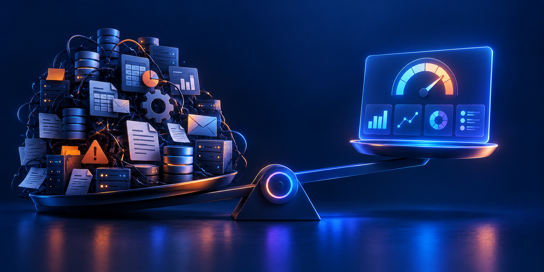
Control is not just a managerial preference; it's a necessity. Managers are the helmsmen of their respective ships, steering through the ever-changing seas of the corporate world. They require timely data and insights to make informed decisions, creating leverage in their strategies. However, this need for control often comes with an inherent challenge: the balance between maintaining control and managing the overhead involved in implementing processes and systems.
Change is the only constant in the business landscape. Whether it's rapid growth, downsizing, strategic pivots, product launches, or structural changes, these shifts demand increased control from managers. The ability to adapt quickly and effectively is crucial. However, during these times of change, managers often find themselves under increased stress and facing new challenges. Their capacity to invest in the necessary overhead for adding processes diminishes, even as the need for these processes becomes more critical.
A poignant example of this dynamic can be observed in Israeli companies during the 2023 war. In these high-pressure situations, processes are often streamlined or bypassed to facilitate immediate action. Managers dive into the trenches, adopting a hands-on approach to ensure continuity and results. While this strategy is effective in the short term, it risks losing sight of the long-term vision and strategic objectives. It's a clear illustration of the trade-off between immediate control and the sustainable management of a company.
Achieving control in management is not without its costs. It requires mental bandwidth to keep track of necessary metrics and the investment in systems and processes. Building databases, reporting, communicating Key Performance Indicators (KPIs), and setting targets are all part of this investment. This overhead can be daunting, especially when resources are stretched thin during periods of significant change.
This is where TargetBoard comes into play. TargetBoard's offers a revolutionary approach, allowing managers to access all their KPIs from day one. It provides a platform where control is enhanced without the corresponding increase in overhead. With TargetBoard's, the system works for the managers, not the other way around. It's an ideal solution for managers who need immediate results and leverage, particularly during challenging transitions.
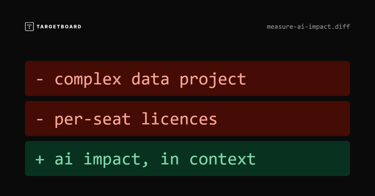
Most AI coding tools can tell you whether they are being used.
You may be able to track active users, adoption rates, suggestions, acceptance rates, generated code, token consumption, or AI-assisted activity.
That information is useful, but it does not tell you whether engineering performance improved.
Consider two teams that both significantly increase AI adoption.
Both teams can report successful adoption.
Only one is showing clear evidence of better engineering outcomes.
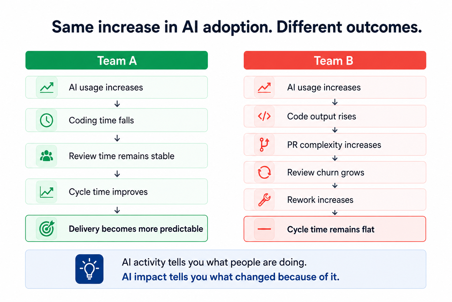
The mistake is jumping directly from adoption to ROI.
High usage does not automatically mean higher productivity, better delivery, or financial return. A more useful model is:
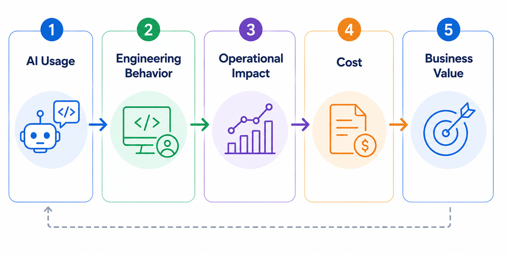
AI may reduce coding time but increase review effort.
It may increase throughput while also increasing rework.
It may deliver significant benefits to one team and almost none to another.
The useful question is not: “How much AI are we using?”
It is: “What happened to engineering performance where AI usage changed?”
Most organizations are not missing the underlying data.
The problem is that each system understands only its own part of the world.
A Cursor usage event does not know what initiative the developer was working on.
A GitHub pull request does not automatically know whether it was AI-assisted.
A Jira ticket does not understand what happened during code review.
An AI license does not tell you if the team using it became more productive.
Take a seemingly simple leadership question:
Answering it reliably may require you to:
Any one of these tasks is manageable.
The complexity comes from keeping all of them correct together.
Teams reorganize. Repositories move. Jira workflows change. AI vendors change. APIs evolve. New leadership questions appear.
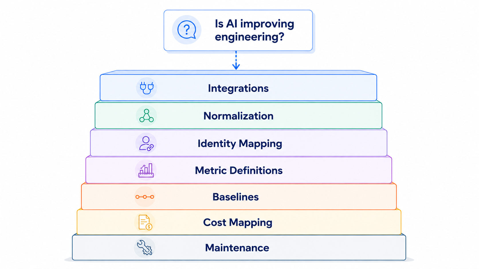
Most engineering organizations have the technical capability to build internal analytics.
APIs, warehouses, transformation tools, BI platforms, internal engineering teams, and increasingly capable AI models are all available.
The question is not whether you can build it.
It is what you want to own.
There is a big difference between connecting Jira and GitHub for a dashboard and maintaining a reliable operational model of the engineering organization.
That model needs to understand relationships between:
And those relationships need to remain accurate as the organization changes.
The internal solution therefore comes with ongoing ownership of connectors, schemas, metric governance, organizational mappings, historical consistency, tool migrations, and analytical logic.
The more useful build-vs-buy question is:
For some organizations, the answer may still be yes.
But it should be a deliberate decision.
A pull request alone can tell you its size, review time, comments, churn, and merge time. Add company context and you can also understand:
That changes the questions leadership can ask.
That is the difference between aggregating engineering data and understanding engineering performance.
Connecting the data still leaves one problem: interpretation.
A dashboard may tell you cycle time increased 18%.
Leadership still needs to determine:
Traditional reporting shows the metric.
Someone still has to explain it.
The next evolution of engineering analytics therefore cannot simply be:
more systems → one dashboard
It needs to be:
Engineering leaders need to understand what changed, what is driving it, and where action is required.
TargetBoard connects data across engineering, planning, AI, organizational, quality, cost, and other company systems while allowing teams to continue working in their existing tools.
That data is normalized into a consistent company context that preserves relationships between people, teams, repositories, work, initiatives, delivery, and outcomes.
On top of that context, domain-expert agents continuously interpret performance to surface what changed, what is driving it, and where risk or opportunity is emerging.
That enables engineering leaders to investigate questions such as:
The goal is not another dashboard. It is removing the data engineering and interpretation work standing between the question and a reliable answer.
AI coding assistants are individual-use tools, so per-seat pricing makes sense.
Engineering intelligence is different.
Its value comes from understanding the organization as a system. A developer does not need to log into an analytics platform for their work to contribute to the operational picture leadership needs.
TargetBoard does not use per-seat pricing.
The objective is organization-wide engineering and AI intelligence, not another product that has to be licensed developer by developer.
Measuring AI impact is technically solvable. The question is how much infrastructure your engineering organization wants to own in order to solve it.
If you build the capability internally, the commitment extends well beyond connecting a few APIs or creating a dashboard. Someone needs to maintain the data model, keep identities and organizational mappings accurate, absorb changes in source systems, preserve historical consistency, and continually adapt the analysis as new AI tools and new leadership questions emerge.
For organizations with highly specific requirements, that investment may be justified.
But for most engineering leaders, the more useful question is whether building and maintaining this measurement layer creates any strategic advantage.
The value is not in owning the pipelines.
It is in being able to answer, with confidence:
Those are management questions, not data-engineering outcomes.
The goal should be to spend less time assembling the evidence and more time using it to make better engineering decisions.
.png)
Most vendor evaluations combine a product demo, a limited developer trial, feature comparisons, and user feedback.
These inputs can show whether a tool is usable, trusted, secure, and compatible with the existing toolchain. They do not establish whether it improves delivery.
A developer may feel faster while using an AI assistant, yet pull requests may still require more review, create more rework, or spend longer waiting to be picked up.
Developer sentiment provides valuable context. Operational data shows what actually changed.
This distinction is particularly important for AI engineering tools. Faster code creation does not automatically lead to faster review, approval, or deployment. A tool may accelerate one stage while moving friction further downstream.
The customer wanted to compare two AI code review automation vendors: Qodo and CodeRabbit.
Rather than testing the tools with unrelated groups or comparing broad company-wide averages, the team used the same defined group of developers throughout the evaluation. Each vendor was tested during a separate period of approximately two weeks.
The methodology was straightforward:
This was not a laboratory experiment. Real engineering environments include differences in repository complexity, work type, team availability, and pull request size.
But it was a structured, real-world comparison that produced stronger evidence than a feature checklist or a collection of opinions.
The objective was not to prove that one vendor is universally better. It was to determine which vendor produced better outcomes in this customer’s environment.
The analysis depended on consistently isolating the developers participating in the POC.
Without a reusable filter, the team would have needed to rebuild the participant group for each metric and evaluation period, slowing the process and increasing the risk of inconsistent comparisons.
Using TargetBoard Saved Filters, the team defined the relevant contributors and pull request creators once, then reused the same cohort across the board.
This made it easier to:
The team could spend less time configuring the analysis and more time interpreting the results.
The customer focused on what happened after code entered the pull request workflow.
This measured the time from the first commit until the pull request was merged.
It provided an end-to-end view of whether work moved more efficiently during each vendor trial. In this evaluation, the Qodo period showed a shorter average cycle time than the CodeRabbit period.
Cycle time should be treated as a system signal. A higher result may reflect delays in pickup, review, coordination, approval, or integration.
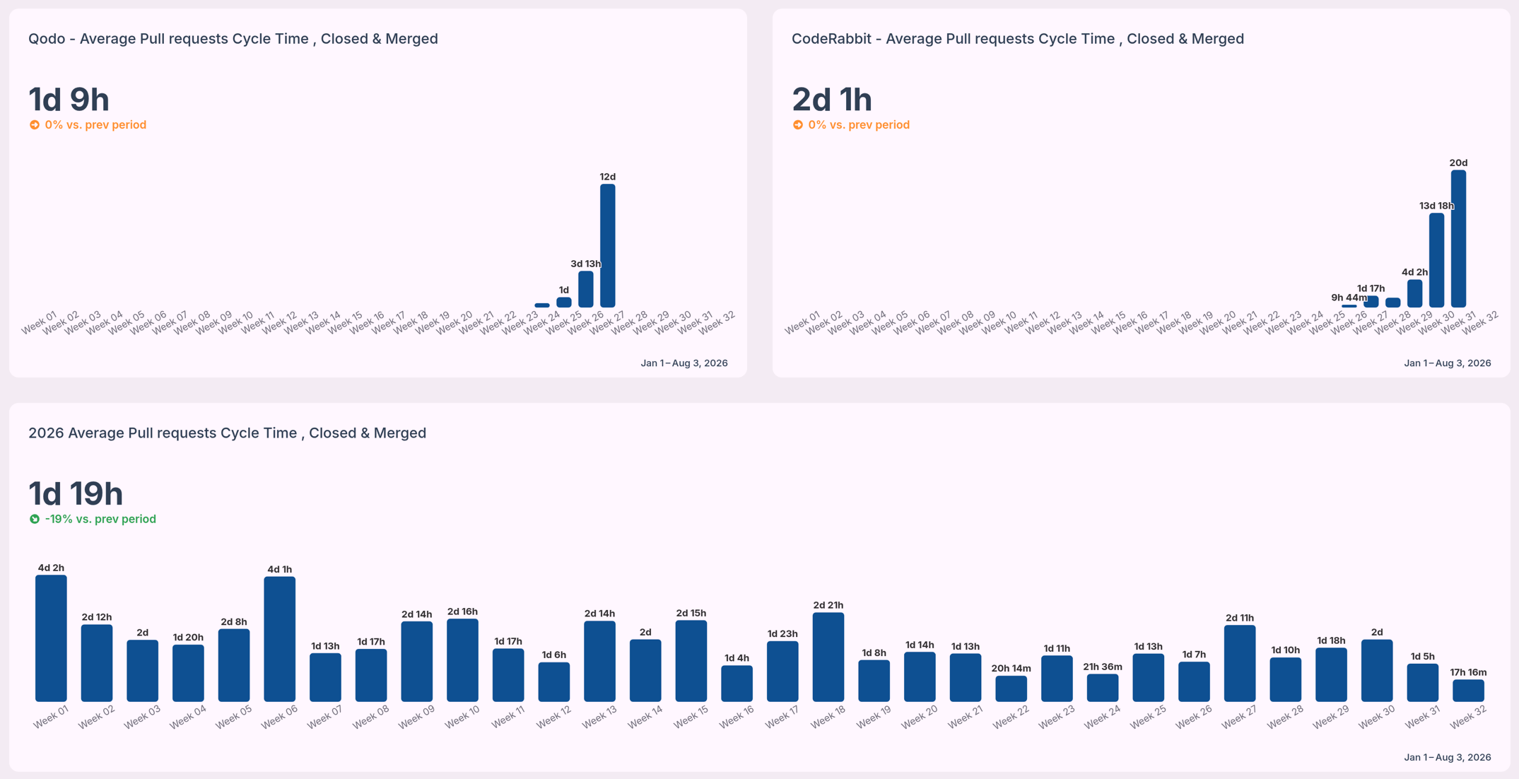
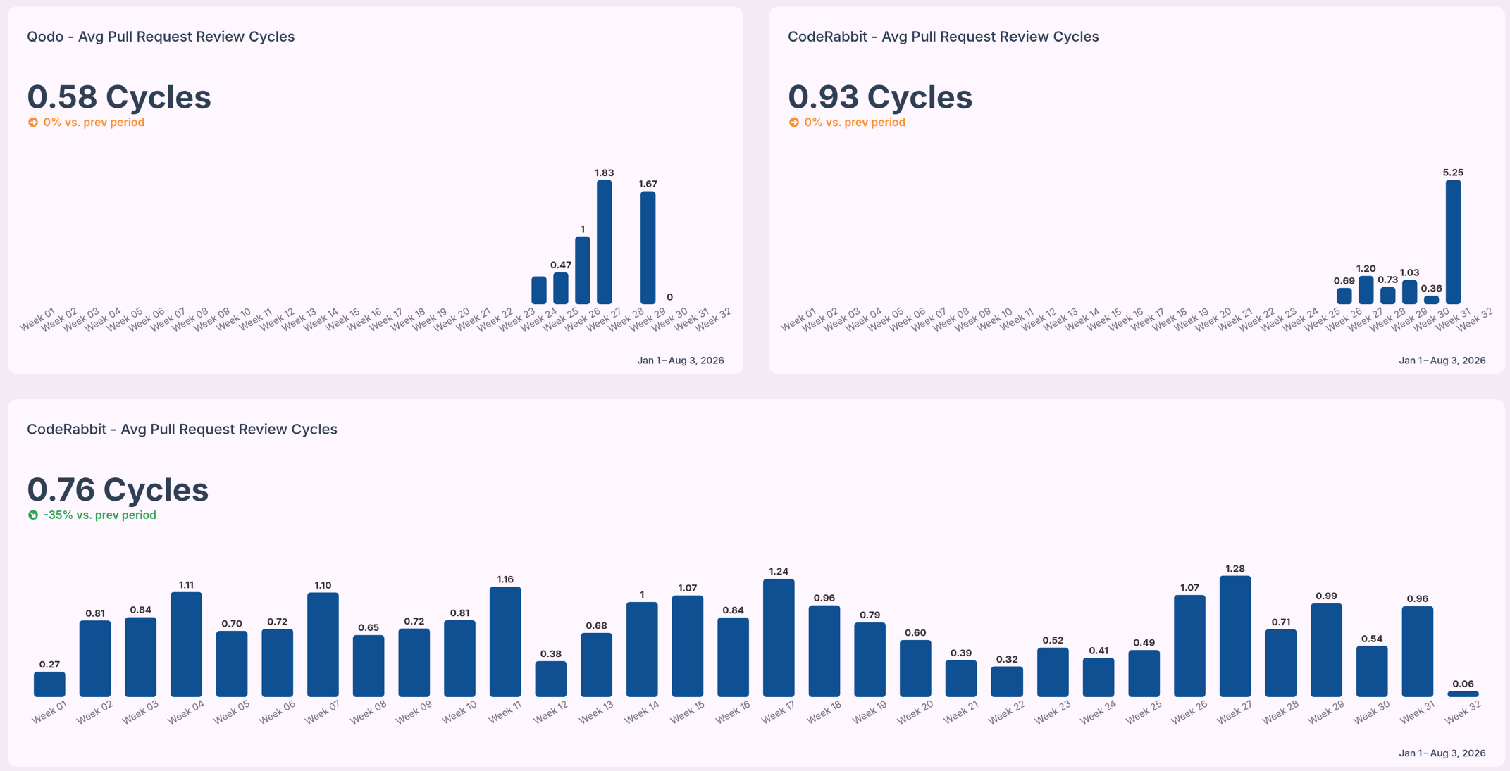
The team also measured how many times a pull request returned to the author for changes before approval.
Fewer review cycles can indicate less back-and-forth and lower review churn. The Qodo period showed fewer average review cycles than the CodeRabbit period.
This was useful evidence, although a full quality assessment would also need to consider defects, incidents, rollbacks, and escaped issues.
Overall cycle time shows that a difference exists. It does not explain where the delay occurred.
The customer therefore examined time spent in stages such as coding, waiting for review, active review, and merge.
This helped distinguish active work from waiting time and showed whether differences came from review pickup, review complexity, or later workflow stages.
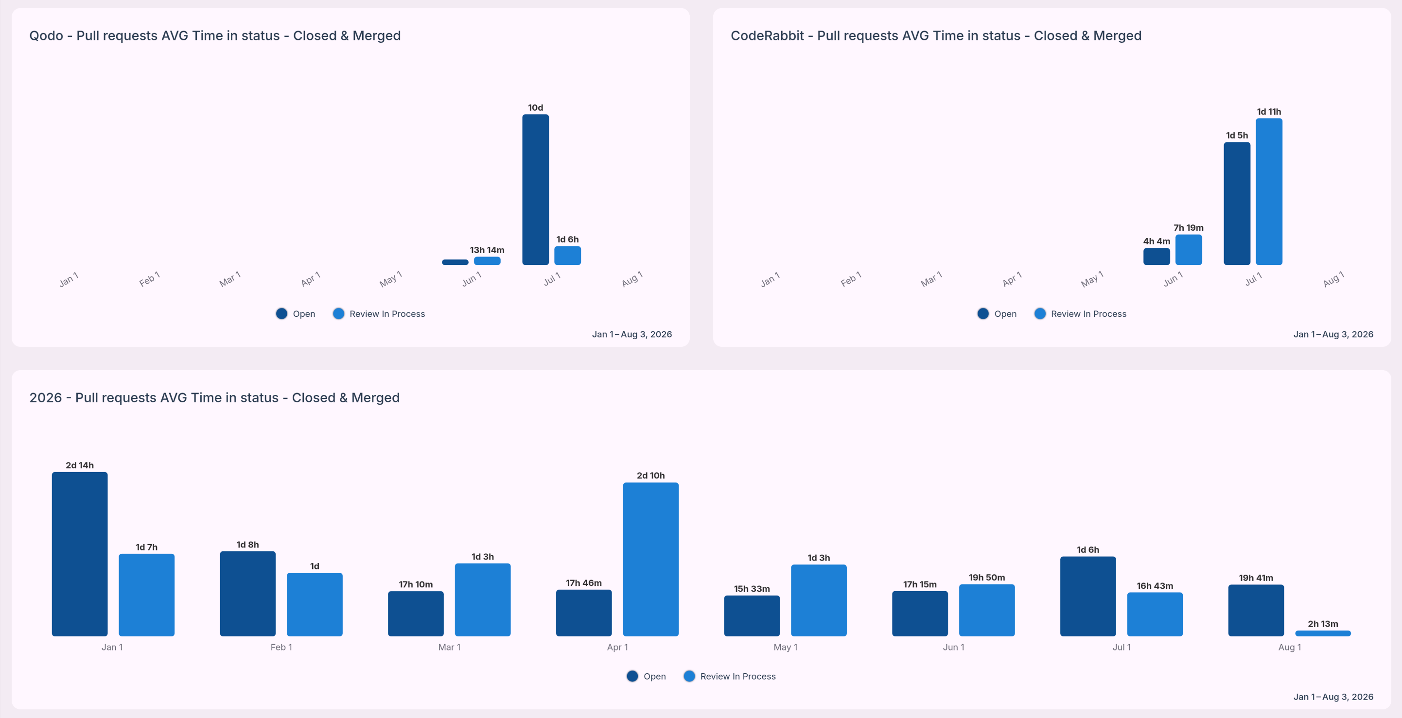
Across the metrics selected for the proof of concept, the Qodo evaluation period showed stronger results than the CodeRabbit period.
The Qodo period recorded:
These results gave the customer a concrete basis for the selection decision.
The team was no longer deciding only which product looked more capable in a demonstration or which tool developers preferred. They could compare how each vendor affected real work inside their engineering system.
The result should remain specific to this customer. It does not establish a universal benchmark for either vendor. The outcome reflected the organization’s developers, repositories, processes, work mix, and evaluation periods.
That limitation does not weaken the analysis. It is what makes the result useful.
The customer needed to know which vendor performed better in its own environment.
A useful AI vendor POC should answer two questions: “Which tool did developers prefer?” and “What changed in the delivery system when the tool was introduced?”.
To build a stronger evaluation:
No single metric should decide the outcome.
A tool may reduce review time while increasing quality risk. Another may receive strong developer feedback but show little measurable effect on delivery. A complete evaluation balances operational outcomes with usability, risk, and cost.
AI engineering vendors should be evaluated on more than features, adoption, and perceived time savings.
The real question is whether a tool improves the flow, quality, and predictability of software delivery.
By testing Qodo and CodeRabbit with a defined group of developers, applying consistent operational metrics, and using TargetBoard Saved Filters to accelerate the analysis, this customer turned a typical POC into a more defensible purchasing decision.
The result was not simply another dashboard. It was a clearer understanding of what changed, where the differences appeared, and which vendor produced the stronger outcome for that organization.
TargetBoard helps engineering leaders compare vendor performance using operational data from their own teams and workflows.
See how TargetBoard can help you build a more objective, repeatable vendor evaluation process.
An ai code review is the process of using Large Language Models to automatically analyze pull requests. These tools scan source code analysis outputs to detect syntax errors and suggest refactoring options before a human reviewer steps in. They excel at identifying boilerplate code issues and enforcing standard automated linters. But they struggle with cross-service dependencies and complex business logic constraints.
The most effective engineering teams treat an ai code reviewer as a high-speed assistant rather than an autonomous decision-maker. AI models lack the operational context to make final architectural decisions. They can't negotiate API contracts or understand why a specific workaround exists for a legacy system.
That means a human-in-the-loop review remains absolutely critical. You use the AI to clear out the noise of code formatting and basic threat detection, so your senior engineers can focus their cognitive energy on system design and business logic.
A major limitation of current AI tools is their reliance on file-level analysis. An AI assistant might review a single pull request and confirm the syntax is perfect. Yet that same code might break cross-service dependencies three layers deep in your application.
This happens because AI context windows face strict VRAM limits and memory constraints, preventing them from holding your entire codebase in memory at once. Trusting AI file-level analysis without verifying the broader repository context is a common mistake that leads directly to architectural drift. Your delivery pipeline must connect code changes to system-wide impacts to prevent this risk.
Yes, a code review ai is highly accurate when evaluating isolated syntax and standard formatting rules. Conversely, accuracy drops to near zero when evaluating complex logic or proprietary frameworks. This drop in precision introduces high rates of false positives and AI hallucinations into your pull requests.
Consider a common scenario where an AI tool successfully identifies a missing variable declaration but completely misses a breaking change in your core payment processing logic. The AI then floods the pull request with dozens of comments about stylistic formatting. Developers end up arguing with an AI bot in the comments over subjective syntax choices, creating massive review churn.
This noise creates an overwhelming backlog for human reviewers and actively slows down sprint velocity. Developer overreliance on these tools compounds the problem. Junior engineers might blindly accept AI suggestions without understanding the underlying code, injecting hidden technical debt into the system. You must measure this friction continuously to ensure the tool is actually accelerating your workflow rather than just generating noise.
Selecting the best ai code review tools requires matching the platform's core capability to your specific workflow bottleneck. You must differentiate between tools that generate code, platforms that scan for vulnerabilities, and systems that measure the systemic impact of those changes.
Tools like CodeRabbit and Qodo focus heavily on pull request summarization. They read the diff and generate a plain-language summary of the changes, so human reviewers can grasp the intent faster. This approach often improves initial time-to-merge metrics for simple tasks.
But open source ai code review tools in this category can struggle when deployed on massive enterprise monorepos. The sheer volume of interconnected files overwhelms the model. This leads to generic summaries that fail to capture the actual architectural impact of the change.
GitHub Copilot and similar IDE extensions operate directly where developers write code. These tools use agentic workflows to suggest entire functions as the developer types. They are incredibly effective at reducing the time spent writing boilerplate syntax.
They operate with a limited view of the broader system. A native extension might suggest a highly efficient sorting algorithm, yet it can't verify if that logic violates broader API contracts established by another team. Human reviewers must still validate those systemic connections.
Enterprise platforms like SonarQube and Greptile focus on strict CI/CD integration. They run deep static analysis to ensure your codebase maintains OWASP compliance and prevents known vulnerabilities from reaching production. These tools are non-negotiable for teams operating in highly regulated environments.
A major consideration in this category is data sovereignty. Sending proprietary enterprise code to external models for security scanning introduces compliance risks. You must configure these tools to ensure sensitive data remains within your controlled infrastructure.
Adopting ai powered code review tools frequently increases raw output while secretly damaging delivery predictability. You need a way to measure this friction. TargetBoard is an agentic operational intelligence platform that helps leadership teams understand how execution is performing, why it is changing, and how to respond.
TargetBoard connects data across company systems and uses domain-expert AI agents to understand workflow bottlenecks. It acts as the essential operational intelligence layer that shows you if your AI coding tools are actually improving sprint velocity or just creating massive review churn.
Implementing ai code reviews requires strict boundaries. You must configure the tool to handle objective rules while reserving subjective architectural decisions for human engineers. If you fail to set these boundaries, the AI will argue with your developers over code formatting and stylistic preferences.
This friction causes massive review churn and slows down your entire pipeline. You must structure the workflow to prevent this noise.
You must map exactly where the AI intervenes in your Software Development Lifecycle. The AI should run its analysis immediately upon pull request creation. It scans for syntax errors, basic code smells, and formatting violations.
The developer resolves these objective flags before a human reviewer is ever assigned to the pull requests. This sequence ensures your senior engineers only spend their time reviewing complex logic and system architecture.
You must train your AI tools using custom rule files specific to your repository. This step prevents the AI from suggesting changes that violate your internal business logic constraints. You can configure the tool to enforce DRY principles and flag code duplication automatically.
The interaction between these custom rule files, the model's context windows, and your code repositories determines the success of the tool. A well-configured rule file reduces false positives and ensures the AI only surfaces actionable insights.
You can't manage what you don't accurately measure. Relying on basic productivity metrics like lines of code written will mislead your leadership team. According to the 2023 DORA Report, true delivery predictability matters far more to business outcomes than raw development speed. You must measure if your ai code review tools are actually accelerating delivery or just shifting the bottleneck.
TargetBoard provides this critical measurement layer. It tracks the difference between AI-generated output and human review times. If an AI tool increases output by 40 percent but causes pull requests to sit in review for three extra days, your actual sprint velocity decreases. TargetBoard exposes these hidden workflow bottlenecks, so you can adjust your strategy based on objective operational intelligence rather than intuition.
The primary value of an AI code review tool is workflow efficiency, not replacing human architectural judgment. These tools are highly effective at clearing out boilerplate errors and enforcing basic code quality. Yet they introduce their own hidden complexities that require continuous systemic measurement.
According to 2024 GitHub Copilot research, AI assistants boost developer productivity by up to 55 percent. You must balance that speed with strict oversight to protect codebase maintainability and prevent the accumulation of technical debt. By running an operational intelligence layer alongside your AI tools, you can safely accelerate software delivery while maintaining complete confidence in your engineering metrics.
.png)
Quick Answer: Platform engineering is the discipline of designing and building self-service workflows to minimize cognitive load for developers.
At its core, an internal developer platform provides:
This approach allows stream-aligned teams to ship code faster without managing underlying operational complexities.
Engineering departments often confuse these roles, and defining clear boundaries is critical for resource allocation. Platform engineers build the paved roads, and DevOps philosophies influence how those roads operate. Without a dedicated platform team, developers often get stuck managing shadow operations instead of writing product code.
Treating the internal developer platform as a mandatory IT project often leads to poor adoption. The Platform as a Product mindset shifts this approach by treating developers as actual customers. Key characteristics include:
The demand for the platform engineering discipline has surged because organizations are struggling to manage the AI impact on software delivery. Developers use artificial intelligence to generate massive volumes of code rapidly, so raw output metrics look incredibly high. But this AI-generated code often introduces hidden complexity and technical debt into the codebase.
Reviewers are forced to spend days validating auto-generated logic. This creates massive workflow friction where code writing is fast but merging is painfully slow. Platform engineering teams are now essential for building the guardrails needed to manage this code surge without sacrificing delivery predictability.
When developers submit highly complex pull requests generated by artificial intelligence, human reviewers can't process them efficiently. This mismatch causes severe workflow bottlenecks that directly inflate cycle time. Pull request churn increases as reviewers request continuous changes to understand the automated logic.
This rework and duplication stall progress across the entire department. When one stream-aligned team gets stuck in an endless review cycle, cross-team dependencies break down. You can't forecast delivery timelines accurately when massive code outputs sit unmerged in fragmented systems.
Platform engineering directly shapes software delivery performance by removing the operational hurdles that slow teams down. A well-designed platform improves execution predictability by:
Golden paths are highly opinionated, supported approaches for building and deploying software. By standardizing these paved roads, platform teams achieve specific outcomes:
Security checks often act as a massive roadblock right before a product launch. Relying on manual approvals and traditional ticket ops forces developers to wait days for a security review, and this actively delays critical releases. Platform engineering solves this by embedding security and compliance guardrails directly into Continuous Integration and Continuous Deployment pipelines.
Developers receive immediate feedback on vulnerabilities while they are still writing code. This shifts security left and eliminates the late-stage friction that frustrates stream-aligned teams.
To evaluate delivery tradeoffs and manage resource allocation effectively, engineering leaders rely on a structured approach to building platforms. According to the Cloud Native Computing Foundation (CNCF) framework, a robust platform requires specific functional areas to operate smoothly^1. These six pillars form the foundation of a predictable delivery system.
A self-service portal provides a single interface for developers to access tools and documentation without filing IT tickets. This centralization reduces context switching so teams can ship features faster.
This pillar automates the setup of cloud resources and deployment environments. You must clearly delineate between basic infrastructure orchestration, which just spins up servers, and advanced operational intelligence, which monitors how efficiently those systems support delivery.
Standardized pipelines govern how code moves from a local commit to a production deployment. Platform teams build these automated routes to ensure every stream-aligned team follows the same reliable path to production.
Automated security checks run in the background to prevent vulnerable code from advancing. This eliminates the need for manual security reviews right before a critical launch.
Observability tools provide real-time visibility into application health and infrastructure performance. If a deployment causes an issue, the platform automatically flags the root cause so developers can resolve it immediately.
Platform teams must track adoption rates and identify workflow bottlenecks to continuously improve the platform. This data proves whether the internal developer platform is actually reducing friction or just shifting the burden to a different system.
Problem: CTOs and engineering leaders often rely on subjective developer surveys or standard engineering metrics to gauge success. These metrics provide useful signals, but they fail to explain why performance is changing or where hidden workflow bottlenecks live within data silos.
Solution: You need an operational intelligence layer to connect fragmented data and track the actual business impact of your platform. TargetBoard is an agentic operational intelligence platform that helps leadership teams understand how execution is performing, why it is changing, and how to respond.
It connects data across company systems and uses domain-expert artificial intelligence agents to guide execution decisions. Instead of looking at a static dashboard showing an unexplained drop in velocity, TargetBoard surfaces the exact workflow friction causing the delay so you can act immediately and improve system-level visibility.
Tracking engineering effectiveness requires a mix of output metrics and deep execution signals. You must measure how fast work moves and understand the context behind those movements to drive predictable delivery outcomes.
Standard DevOps Research and Assessment frameworks measure critical aspects of software delivery performance. They are excellent supporting signals for your organization. But they don't provide system-level visibility into why a team missed a deadline or why a specific repository is suddenly generating massive technical debt.
Consider the edge case where auto-generated code introduces hidden structural complexity. Standard delivery metrics entirely miss this technical debt until it causes a production incident months later. To truly measure engineering effectiveness, you must transition to operational intelligence that connects signals across planning, code, and delivery systems.
According to Gartner research, most software engineering organizations will establish platform engineering teams by 2026^2. But the platform engineering discipline requires internal cultural shifts and disciplined adoption. It's never just about purchasing software and hoping for a productivity spike.
Referencing Team Topologies provides a strong structural foundation for designing successful platform teams that interact smoothly with the rest of your engineering department^3. When you combine a well-structured platform team with proactive operational intelligence, you stop reacting to stale data. You gain the execution predictability needed to lead with complete confidence.
.png)
Leading and lagging indicators are the two primary data categories used to evaluate engineering performance. Lagging indicators measure the final results of a process after it concludes. Leading indicators measure the upstream activities and inputs that predict those future results.
Think of this dynamic through the classic windshield versus rearview mirror analogy because it clarifies how you use the data to make decisions. Leading indicators are forward-looking metrics that act as your windshield, helping you anticipate the road ahead. Lagging indicators are backward-looking metrics that serve as your rearview mirror, showing you exactly where you have been. You need both, so you can make accurate execution decisions.
You can quickly audit your current reporting dashboards to evaluate leading versus lagging indicators. Ask these diagnostic questions to determine if your data provides actionable insights or just a historical record:
Investopedia and standard corporate glossaries focus on marketing or sales data when defining leading and lagging indicators. Engineering executives need specific engineering performance metrics mapped to the software delivery lifecycle.
Lagging indicators confirm the final results of the software delivery lifecycle. They are essential for aligning engineering efforts with broader business outcomes. These metrics tell you if a project shipped on time or if a release met quality standards.
Platform engineering teams also track coincident indicators, which measure activity happening right now. The core value of a lagging indicator remains its definitive proof of past performance. Common examples include total bugs found in production and final release frequency.
Leading indicators highlight the friction points happening right now that will inevitably impact your final delivery metrics. These signals allow you to intervene early. If you track Pull Request size and complexity, you can predict which code reviews will stall.
High review churn acts as a clear warning sign, often predicting technical debt and poor code quality. Monitoring cross-team dependencies helps you spot coordination bottlenecks before they derail an entire release timeline. Managing these inputs gives you direct control over the eventual outcomes.
Standard measurement frameworks provide valuable signals about overall organizational health, but they lack the operational understanding needed to drive daily execution. CTOs and VPs of Engineering have experienced the frustration of presenting stalled delivery metrics to a board while their dashboard shows green across the board. Delivery can suddenly halt despite good past metrics because standard tools lack systemic visibility. They force you into a state of reactive management.
This gap becomes critical when teams introduce AI-generated code into their workflows. AI tools dramatically increase code output volume, which creates a false sense of speed. That sheer volume introduces hidden complexity and massive review bottlenecks that standard frameworks fail to catch until cycle time completely collapses. Output volume isn't the same thing as delivery predictability.
You can't manage a modern engineering organization by looking at outcomes alone. You must establish a clear cause-and-effect relationship between your daily engineering activities and your final business results.
Tracking both lead and lag indicators allows you to perform root cause analysis in real time. If you see a predictive signal flashing red, you can course-correct before the sprint fails. According to the 2023 Forrester Research report on engineering operations, teams that actively monitor upstream workflow friction achieve significantly higher delivery predictability than teams tracking only final deployment rates.
Engineering executives know they must track predictive signals to prevent delivery failures. The reality is that manually piecing together fragmented data across tools like Jira and GitHub to compare lagging vs leading indicators is completely unsustainable. You often end up with conflicting signals where Jira shows a project on track while GitHub shows massive review delays.
To truly act on predictive signals, leaders need a system that automatically connects cross-system workflow behavior to delivery metrics to explain why performance is changing. This requires an evolution from passive observation to active intervention.
By unifying this fragmented data, an operational intelligence layer gives you the context needed to make confident execution decisions. You stop relying on stale reports and start managing the actual flow of work.
Understanding the difference between outcome metrics and predictive signals changes how you run your engineering organization. You gain the ability to measure and manage performance based on operational reality rather than retrospective reporting.
This approach gives you a clear framework for technical risk mitigation and smarter resource allocation. By monitoring workflow friction early, you protect your long-term maintainability rather than waiting for a North Star Metric to drop at the end of the quarter. You stop reacting to missed deadlines and start actively guiding your engineering systems toward predictable and sustainable delivery.
.png)
Engineering analytics is the practice of analyzing data from the software development pipeline to understand and improve software delivery performance. It connects fragmented data points across issue trackers and code repositories to give leaders systemic visibility.
The goal is to move beyond simply measuring output and start governing the entire delivery system. This continuous evaluation of engineering metrics helps organizations identify bottlenecks and align daily work with strategic business outcomes.
Search results often mix these two distinct concepts. Analytics engineering is a specific job title within the modern data stack. These professionals build and maintain the data pipelines that data scientists use for business intelligence.
Engineering analytics is an operational discipline used by technical executives. VPs of Engineering and CTOs use this discipline to monitor workflow bottlenecks and maintain delivery predictability.
Imagine staring at a dashboard on Friday afternoon during a critical delivery cycle. Deployment frequency looks healthy, yet lead time for changes has doubled. Your engineering managers spent hours dealing with manual reporting overhead to build this view, but the dashboard can't explain the root cause of the delay.
This highlights the fundamental problem with passive reporting. Dashboards give you metrics without context. They show a snapshot of past performance but offer zero actionable insights to resolve the workflow friction. Analytics requires an operational intelligence layer to interpret those signals and guide your response.
Understanding the evolution of data maturity helps clarify why dashboards fall short. The industry breaks analytics into four operational stages.
AI coding tools are fundamentally changing how work is produced. They accelerate initial output, so developers ship more volume in less time. Traditional developer productivity frameworks look at this spike in velocity and assume the system is highly efficient.
But this volume introduces massive hidden complexity. The difference between AI-generated code vs. human-written code often shows up during the review phase. An AI tool might write a feature in ten minutes, but that high-complexity pull request can sit in review for four days. Human reviewers struggle to validate the dense logic, creating severe workflow friction.
The deployment metrics look temporarily inflated, yet technical debt quietly accumulates in the background. The delivery system slows down over time as developers spend hours untangling complex PRs instead of writing new features. You can't manage this new reality with basic dashboards because they measure the speed of creation while completely missing the downstream cost of code review.
The core issue is no longer a lack of visibility. Jira and GitHub provide enough raw data to achieve system-level visibility, yet engineering leaders still lack objective understanding. You need a reliable way to turn conflicting metrics into clear execution decisions without relying on manual analysis or guesswork.
TargetBoard is an agentic operational intelligence platform that connects data across company systems, interprets performance continuously, and uses domain-expert AI agents to guide execution decisions. It automatically interprets fragmented data across your tools to uncover hidden issues like PR churn.
This intelligence layer surfaces decision-ready insights for leaders. You can restore delivery predictability and identify bottlenecks objectively, allowing your teams to stop reacting to stale reports and start addressing workflow friction as it happens.
VPs of Engineering mistakenly treat deployment metrics as a complete measure of developer productivity rather than just a starting signal. According to the 2023 DORA report, elite performing teams prioritize delivery predictability and system reliability alongside raw speed. Frameworks like DORA metrics and the SPACE framework provide valuable benchmarks for these outcomes.
But these frameworks don't provide systemic understanding. They tell you that a metric shifted, yet they can't isolate the root cause behind the shift. You need an active intelligence layer to connect those framework signals to actual workflow behavior.
Real execution decisions happen when you connect data to specific workflow bottlenecks. Consider a sprint where cycle time spikes by 40 percent. A basic dashboard simply reports the delay, but operational intelligence reveals the actual mechanics.
According to 2023 industry benchmarks from LinearB, pull request review time accounts for 70 percent of delivery delays. In this scenario, three high-complexity pull requests sat in review for over four days due to cross-team dependencies, directly causing that 40 percent cycle time spike. Identifying pull request (PR) churn at this granular level allows you to reallocate senior engineers to clear the backlog immediately.
Selecting the right platform requires evaluating how well it moves your organization from reactive reporting to proactive governance. Modern engineering analytics systems and engineering analytics tools fall into three primary categories. You need a unified source of truth to manage complex delivery pipelines effectively.
Relying on output metrics alone creates a false sense of security, especially when AI tools inflate short-term velocity. True organizational improvement requires understanding how work flows through your entire delivery pipeline. Shifting from passive dashboards to operational intelligence gives you the context needed to drive execution alignment.
Understanding these patterns gives you a clear framework for your next resource allocation decision. You can stop reacting to delayed reports and start managing delivery predictability proactively.

Mean time to recovery (MTTR) is the average time it takes your organization to fully restore a system after a failure. This metric serves as one of the most critical lagging indicators of your engineering organization. It reveals how well your systems and teams handle unexpected outages.
A "good" target depends entirely on your operational maturity. The 2023 Accelerate State of DevOps Report indicates that elite performers recover in less than one hour. High performers typically restore service in less than one day. Hitting that elite tier requires more than just fast typing during an incident. It requires clear ownership boundaries and immediate access to system-level data.
You calculate this metric by dividing your total downtime by the number of incidents over a specific period. To calculate recovery speed accurately, track these components:
If a core payment service experiences 120 minutes of total downtime across four separate outages in one month, your recovery speed averages 30 minutes per incident. The clock starts the exact moment the system degrades and stops only when full functionality is confirmed for the end user.
Incident management relies on precise terminology. The four "R" metrics often get conflated, so understanding the boundaries of each helps you pinpoint exactly where bottlenecks occur.
You invest in automated alerting and refine your incident response process, yet your DevOps metrics remain stagnant. The flaw lies in treating slow recovery strictly as a failure of the response team. When metrics plateau, the root cause is rarely a lack of effort. The friction usually stems from upstream bottlenecks that make the system impossible to debug efficiently during a crisis.
Consider a realistic deployment failure where a database schema update breaks a legacy checkout service. Alerts fire from your monitoring tools immediately. Your on-call engineer acknowledges the page in under two minutes, and the team executes the rollback runbook flawlessly. But that database state change can't be reversed without manual intervention from a separate data engineering team.
The issue escalates into a multi-hour outage because cross-team coordination breaks down. The dependencies between the new schema and the legacy service were entirely undocumented. Data silos across Jira, GitHub, and Slack mean the responding engineers can't see who actually owns the upstream database changes. This system variability proves that you can't simply streamline documentation to compensate for fragmented architecture.
Enterprise engineering teams attempt to diagnose these plateaued recovery times using standard industry frameworks. Tracking deployment frequency and change failure rate is standard practice for measuring operational maturity. A common operational mistake is treating these framework metrics as a root cause diagnostic tool rather than a lagging signal.
DevOps Research and Assessment metrics provide signals, but they don't provide understanding. They tell you that a deployment failed or that recovery took four hours. They don't tell you that a massive, highly complex pull request bypassed rigorous code review due to a rushed release management process. Relying solely on these lagging indicators leaves leaders with metrics without context. You see the numbers shift, so you know a problem exists, but you lack the operational intelligence to identify the specific workflow friction causing it.
When an outage strikes, the clock ticks relentlessly while engineers struggle to map the system architecture. Upstream constraints are the actual culprits behind sluggish recovery times. If you want to improve response speed, you must look at how work flows through your continuous delivery pipelines before the code ever reaches production.
A team burdened by high technical debt and review churn will inevitably build brittle systems. These underlying structural issues dictate how quickly your team can isolate a defect.
Modern software delivery relies on a massive web of microservices, and this creates intense workflow friction when things break. Performance data and system context are trapped in data silos. Code lives in GitHub, tickets sit in Jira, and deployment logs are buried in separate observability tools. According to a 2023 Forrester Report on incident response, teams often spend up to 70% of an incident's duration simply trying to locate the root cause and the correct service owner. Fragmented ownership means cross-team boundaries are blurred. If a deployment fails due to an upstream API change, the on-call engineer can't confidently roll back the change without risking further cascading failures.
AI coding assistants are accelerating output, but they also introduce severe hidden complexity into your codebase. A developer might use AI to generate 500 lines of logic that look perfectly clean in a pull request. The reviewer scans the syntax, sees no immediate issues, and approves the merge to keep cycle time low.
In the production environment, that same code triggers complex failures under high load. The defect patterns are entirely unfamiliar because a human did not write the underlying logic. Debugging becomes a nightmare. Responders can't rely on institutional knowledge to trace the error, so they must reverse-engineer the AI-generated logic while the system is down. This hidden code complexity turns a standard five-minute fix into a multi-hour investigation.
Understanding the broader landscape of incident metrics helps you isolate specific reliability risks. Mean time to recovery focuses on restoring service, but it sits alongside other critical measurements that track stability and response initiation.
You can't lower your recovery time simply by paging developers faster or conducting more rigorous post-incident reviews. Fast recovery requires understanding why systems are changing before an incident ever occurs. You must move away from reactive incident management and embrace proactive monitoring anchored in system-level visibility.
TargetBoard is an agentic operational intelligence platform that helps leadership teams understand how execution is performing, why it is changing, and how to respond. It connects data across company systems, interprets performance through operational intelligence, and uses domain-expert AI agents to guide execution decisions.
TargetBoard unifies fragmented data across Jira, GitHub, and your delivery systems into a single trusted model. The platform deploys domain-expert AI agents to map dependencies and detect workflow friction upstream. It identifies AI-generated code risks and surfaces hidden complexity before that code merges into production. This transforms automated alerting from passive dashboards into actionable decisions. We don't just measure engineering performance. We explain why it's changing. This approach gives you the operational intelligence necessary to stabilize your architecture and typically improves true delivery predictability.
Pushing your incident response teams to work faster will only yield diminishing returns. The speed of your recovery is dictated by the clarity of your system architecture and the accuracy of your data.
Improving your mean time to recovery requires a fundamental shift in operational maturity. You must break down data silos, clarify ownership boundaries, and actively manage the hidden complexity introduced by AI coding tools. By gaining true visibility into your engineering efficiency, you can eliminate the upstream friction that causes outages to spiral out of control.

What is velocity vs capacity in Agile? Understanding velocity vs. capacity comes down to separating what a team did in the past from what they can actually do right now. VPs of Engineering often treat velocity versus capacity as interchangeable data points during sprint planning. But they measure entirely different dimensions of engineering operations.
Velocity looks backward at what a team achieved, so it provides a baseline for expectations. Capacity looks forward at who is actually in the room, which grounds those expectations in reality. You can't build a reliable forecast using only one side of this equation.
Velocity is a lagging indicator that measures historical performance. It calculates the average number of completed story points a team delivered over recent sprints. This metric gives you a baseline of past performance under previous conditions. But it doesn't account for new complexities or current workflow friction.
Capacity is a leading indicator that defines future availability. It measures the actual time your team has to work on new commitments based on real-time constraints. This includes tracking team availability after accounting for meetings, operations overhead, and focus hours. Capacity tells you exactly who is in the room and ready to build.
You can't plan a sprint using only one side of the equation. If you only measure velocity, you will overcommit during weeks with high time off and PTO. If you only determine capacity, you lack a benchmark for how much work fits into those available hours. You must combine both to plan sprint cycles effectively.
Follow this sequence to align team commitments with actual execution reality.
Smart resource allocation requires you to commit to less work than your maximum mathematical capacity. This buffer creates a sustainable pace that absorbs complex pull request reviews and inevitable context switching. Operating at 100 percent capacity guarantees that any minor workflow friction will immediately derail your commitments.
Executives often conflate these distinct metrics when evaluating team performance. Understanding the difference between velocity, capacity, and load is critical for diagnosing why a team is burning out.
When team load consistently exceeds actual capacity, delivery predictability collapses. Teams will start cutting corners on code quality or accumulating technical debt just to maintain the illusion of stable velocity.
You have likely sat in a board meeting where engineering leadership reports a perfectly stable velocity, yet the actual product roadmap is slipping by weeks. This scenario sits at the center of the velocity vs capacity debate. The disconnect happens because velocity measures raw output, not true productivity.
A team can easily burn down 40 points of minor bug fixes while the core architectural work stalls completely. When executives treat velocity as a prescriptive performance target rather than a descriptive planning tool, they incentivize measurement theater. Engineers start optimizing for story points to keep the charts looking green, sacrificing sustainable value delivery in the process.
The primary reason teams miss commitments is that engineering operations rely on siloed data. You plan in one system and write code in another, so you never get a clear picture of actuals vs execution data. This fragmentation masks the true workflow friction draining your capacity and directly erodes trust in board-level reporting.
When your measurement systems are disconnected, your capacity planning becomes a guessing game. You see the cycle time increasing, but you can't see the underlying coordination breakdowns causing the delay.
Problem: Engineering managers struggle to reconcile their planning data with actual execution because standard tracking metrics in tools like Jira treat performance as isolated features.
Solution: The Jira velocity chart specifically tracks historical performance by displaying the number of story points completed in past sprints. Jira capacity planning is a separate function that calculates future availability based on user-entered schedules and hours. The critical difference is that both features rely entirely on manual inputs, so neither accounts for the actual code-level bottlenecks or real-time review delays happening in your version control system.
Modern software development has introduced a massive new variable to the capacity equation. Artificial intelligence coding assistants accelerate the initial drafting of code, which artificially inflates your team's velocity. A developer can generate hundreds of lines of logic in minutes.
But this AI code generation impact introduces a hidden drag on your actual capacity. High-complexity pull requests sit in the code review process for days because human reviewers struggle to validate large blocks of AI-generated logic. According to 2023 industry benchmarks from DevEx research, pull requests often sit idle for nearly 70 percent of their lifecycle. This PR review churn drains focus hours and causes multi-day PR delays, even while the team shows a "good" historical velocity on paper.
Your capacity planning must account for the reality of how enterprise engineering actually operates. Unplanned work and urgent incident responses consistently drain focus hours. Context switching between feature development and bug fixing destroys momentum. According to research from the American Psychological Association, shifting between complex tasks can cost up to 40 percent of a professional's productive time.
This friction multiplies when you factor in cross-team dependencies. A team might have the capacity to write the code, but they are blocked waiting on an API from another department. If you ignore these interruptions and the compounding weight of technical debt, your capacity plan is just a theoretical best-case scenario. This becomes especially critical during holiday weeks or major operational incidents, where actual capacity drops to a fraction of your standard baseline.
Standard measurement frameworks like DORA and SPACE provide valuable industry benchmarks. But they are only partial signals. They don't tell you that cycle time increased because three high-complexity, AI-generated PRs sat in review for four days due to a cross-team coordination breakdown.
The primary gap in delivery predictability is not a lack of metrics. The gap is a lack of operational intelligence connecting those metrics to actual execution. You need a unified data layer to see what is actually happening across Jira and GitHub so you can understand why execution stalls.
TargetBoard is an agentic operational intelligence platform that connects data across company systems, interprets performance through operational intelligence, and uses domain-expert AI agents to guide execution decisions. It bridges the gap between static planning metrics and actual delivery. TargetBoard’s domain-expert AI agents surface hidden workflow bottlenecks in real time. It acts as a systemic execution layer that explains why performance is changing, empowering leaders to make proactive decisions with absolute delivery confidence and align their engineering efforts with actual business outcomes.
Shifting your focus from outcome vs output requires a fundamental change in how you view engineering data. Agile velocity vs capacity is not just a math problem for your scrum masters to solve. It's a strategic framework for understanding your delivery predictability.
Understanding these patterns gives you a clear operational model for your next sprint planning session. Stop relying on lagging indicators to guess your future availability. Connect your planning data to your execution reality, identify the hidden friction draining your focus hours, and build a system that actually explains your engineering performance.
.png)
One of the pivotal inspirations behind TargetBoard emerged from an experience at a highly successful tech unicorn, known for its data-centric product where integrity and reliability are foundational. Our casual discovery of a critical metric being off by 90% set the stage for our venture. This discrepancy went unnoticed within the organization, and even after we rectified the issue, there was no subsequent initiative to probe whether other key performance indicators (KPIs) were similarly misaligned.
Data is the backbone of decision-making. We rely on it not just for strategic decisions but for daily operational choices as well. However, once KPIs are set, it’s rare for them to be revisited or audited for accuracy. This oversight can lead to significant misjudgments, based on distorted data views that everyone assumes are correct.
This very unicorn, now a TargetBoard client, represents a full-circle moment for us. With our platform, they uncovered several additional KPIs needing recalibration. The initial setup of these metrics no longer reflected the current realities of their business, illustrating a common challenge in the dynamic tech landscape.
Data teams are often stretched thin, focusing on maintaining the continuous flow of data while struggling with outdated tools that fail to support effective data management. This is where TargetBoard steps in, providing a robust solution that not only presents data vividly but also insists on its accuracy, making it impossible to ignore. As one customer put it, “I love how you guys are putting the data in my face, making it so I can’t ignore what I’m seeing.
”While some organizations may prefer the proverbial “ostrich approach” of ignoring potential issues, TargetBoard is designed for those who prioritize responsiveness and informed action. Our platform adds a critical layer of verification to your data processes, ensuring the KPIs you depend on reflect the true state of affairs.
In the fast-paced, ever-evolving world of tech, the ability to trust your data and react swiftly to its insights is not just an advantage—it's a necessity. TargetBoard makes this not only possible but also seamless and affordable. For organizations looking to ensure their data truly represents their operational reality, TargetBoard is an indispensable ally.
Join us in empowering your data oversight. With TargetBoard, watch your back by watching your data with the vigilance it deserves.

.webp)