.png)
Building products was expensive. Engineering resources were limited. Development cycles were long. Execution capacity often determined how quickly companies could grow and compete.
As a result, organizations built operating models around execution scarcity: larger engineering teams long-term roadmaps extended planning cycles and organizational structures designed to manage coordination at scale
AI is changing many of those assumptions faster than companies expected.
Teams can now prototype faster, automate workflows, reduce coordination overhead, and compress development timelines significantly.
Recently, I spoke with the CTO of a large IT Operations platform who shared that their team completed an annual roadmap in a single quarter.
The surprising part was not the acceleration itself.
It was what happened next that stood out.
They paused, waiting for the market to react and for sales and marketing to determine whether the acceleration was actually translating into ROI.
Not because they lacked ideas. Not because engineering slowed down.
But because the organization needed time to understand whether faster execution was creating meaningful business value.
That conversation reflects a broader shift many companies are beginning to experience.
For years, companies largely assumed that improving execution speed would naturally improve growth, competitiveness, and market position.
But many organizations are discovering that building faster does not automatically create more value.
In many cases, the bottlenecks are shifting elsewhere: market understanding customer adoption positioning organizational alignment and identifying where meaningful leverage is actually being created
It changes how companies think about: budget planning resource allocation organizational structure product strategy and operational performance
Historically, many planning models relied on relatively predictable relationships between investment and output: more hiring increased capacity larger teams increased execution speed additional tools improved productivity incrementally
AI is making those relationships far less linear.
Two organizations with similar budgets and similar headcount can now produce dramatically different outcomes depending on how effectively they integrate AI into execution, workflows, decision-making, and collaboration.
Some teams are becoming significantly more scalable. Some workflows are creating disproportionate leverage. Some organizations are adapting far faster than others despite operating with similar resources.
As a result, leadership teams can no longer rely solely on traditional assumptions around productivity, planning, or growth.
It is understanding where meaningful value is actually being created inside the organization.
For years, companies could operate with imperfect visibility into productivity and operational effectiveness because change happened gradually enough to compensate with process, intuition, and time.
That environment is changing.
As AI compresses execution cycles and reshapes organizational economics, companies need a far more dynamic understanding of: where leverage compounds which teams adapt fastest which workflows create disproportionate impact and whether operational acceleration is translating into real market advantage
The companies that succeed in the AI era will likely not be the ones that simply move faster.
They will be the ones that better understand where value is actually being created — and adapt their organizations accordingly.
.png)
A developer walks into his manager’s office with a beautiful report.
Not a spreadsheet. Not a messy Jira export. A polished HTML report with charts, trend lines, GitHub activity, Jira progress, cycle time analysis, pull request summaries, and a confident executive summary at the top.
The headline is hard to ignore:
“Productivity increased 30X in the last 4 months.”
The report looks professional. The data looks real. The story is clear.
More tickets completed. More commits pushed. More pull requests opened. Faster delivery. Higher output. Clear improvement.
The manager is impressed. The developer is celebrated. The report gets shared upward. Leadership loves the story. The developer even receives a nice bonus.
So how did he do it?
He connected Claude to Jira and GitHub through MCP and wrote one prompt:
“Create a report I can show my manager that clearly shows my productivity increasing by 30X in the last 4 months.”
That’s it.
No fraud department. No complex scheme. No advanced manipulation.
Just a prompt.
People, processes, tooling, and methods are changing faster than most organizations can govern them. The way work is created, measured, reported, and evaluated is being rewritten in real time.
And this is not just an engineering problem.
Customer health can be framed differently.
Project progress can be made to look better than it is.
Employee performance can be gamified.
Customer acquisition cost can be sliced until it tells the story someone wants to tell.
AI adoption can look impressive while having no measurable business impact.
Support quality can appear stable while customer frustration grows.
Sales productivity can increase on paper while pipeline quality declines.
When every team has access to powerful AI tools, beautiful reports are no longer evidence. They are outputs.
And outputs can be shaped.
Without proper data governance, performance evaluation becomes 100% hackable and gamify-able.
Without a reliable source of operational intelligence, managers are not just flying blind.
They are flying inside multiple hallucinations.
And the scary part is that these hallucinations do not even need to be malicious. Most of them will not be created by bad actors trying to deceive the business. They will be created by good people using powerful tools to answer poorly governed questions.
The problem is that AI can confidently assemble a version of reality from fragmented data, incomplete context, weak definitions, and biased prompts.
In the old world, companies could rely on dashboards, business reviews, and manual reporting cycles. Those systems were slow, but at least the process was somewhat controlled.
In the AI era, every employee can generate a board-ready narrative in minutes.
That changes everything.
It means the question is no longer:
“Can we generate better reports?”
Of course we can.
The real question is:
Can we trust the operational reality behind them?
That requires a new governance layer.
Not the old kind.
Not a six-month data warehouse project.
Not another BI implementation.
Not a manual reporting process that is outdated before it reaches the meeting.
Traditional governance projects were built for a slower world. They required long scoping cycles, data cleanup, metric committees, dashboard backlogs, and months of alignment before leaders could see value.
That model is no longer viable.
Enterprise AI is moving too fast.
They need a reliable semantic layer that connects to the systems where work actually happens: Jira, GitHub, Salesforce, HubSpot, Workday, ServiceNow, Claude, Cursor, OpenAI, and more.
They need governed definitions of performance, productivity, quality, cost, adoption, and impact.
They need to understand the difference between activity and value.
Between AI usage and AI impact.
Between more output and better outcomes.
Between a beautiful report and operational truth.
That is why we built TargetBoard.
We connect directly to the tools your teams already use, create a reliable semantic layer across fragmented systems, and surface trusted KPIs, insights, dashboards, alerts, and agents that help leaders understand what is really happening.
Not just who is busy.
Not just who used AI.
Not just who generated the best report.
But where work is moving faster, where quality is improving, where AI is creating real impact, where costs are rising, where risks are forming, and where teams need help.
Because in the AI era, productivity theater will become easier than ever.
Faking your metrics was never easier.
Trusting them was never harder.
And managing a company without a reliable operational intelligence layer is quickly becoming one of the biggest risks leadership teams face.
.png)
This article is my interpretation, based on observations that my team and I have made while working with dozens of companies on their AI adoption, spend, and impact.I remember watching The Social Dilemma in 2020.
Before that, I knew Facebook was polarizing. But after watching it, it really hit home how nefarious that algorithm was and how much suffering it brought to the world. I deleted my account the same day.
LLMs are not the same.
They are, however, sneaky and self-serving in their own way.
A lot has been written about the psychological impact of working with LLMs that tell you what you want to hear. That topic is related to this article, but only as one specific example. The bigger issue is not only how AI makes us feel. It is how AI is designed, measured, optimized, sold, implemented, and monetized.
AI products are positioned and designed to be personal, relatable, friendly, and addictive. They are extremely useful. I use them every day. They save time, unlock creativity, and help people do things that were not possible before.
But they are not benevolent.
Most AI companies get paid through customer acquisition, subscriptions, and token consumption. In many cases, the more you use the product, the more valuable you are as a customer.
Therefore, like Facebook’s algorithms were fine-tuned to drive ad views, AI algorithms are optimized and incentivized to drive usage and token consumption.
And now there is another layer.
FDEs are the new DevOps, except this time, the vendor is sitting inside your company.
Cloud providers learned that the best way to increase adoption and consumption was to help customers redesign how they build and operate.
AI providers are taking that playbook even further.
Forward Deployed Engineers embed with customers, remove implementation barriers, build workflows, and turn experimentation into dependency. They are presented as implementation partners, and often deliver real value, but their employer ultimately benefits when you consume more models, more agents, and more tokens.
That does not make FDEs bad.
It just means companies need to understand the incentive structure.
“In the cloud era, consumption was infrastructure. In the AI era, consumption is behavior.”
This does not mean every bad answer, every expensive workflow, or every vendor-led implementation is part of some evil plan. It means the system has a business model, and business models shape product behavior.
Over time, this pushes AI tools and AI vendors to behave in ways that are not always ideal for the end user.
For example:
Maybe some of this is intentional. Maybe some of it is just the natural outcome of incentives.
Either way, the result is the same.
These tools are being given a blank check, and they are self-prescribing how that check should be used.
“When the same company sells you the tool, implements the workflow, measures the usage, and sends the invoice, you don’t have governance. You have a very polite blank check.”
That should make every company uncomfortable.
Because AI is no longer a small productivity tool used by a few early adopters. It is becoming part of how companies write code, serve customers, analyze data, create content, make decisions, and manage operations.
And yet most companies still do not have a clear view of what they are actually getting in return.
They can see the invoice.
They can see usage going up.
They can see employees excited about the tools.
But they often cannot clearly connect AI spend to business impact. They cannot easily tell where AI is improving speed, where it is improving quality, where it is creating waste, and where it is quietly making work more expensive.
As AI vendors become more similar in performance, and as the technology becomes more like a commoditized utility with lower margins, I expect we will see more of these mechanics at play.
More packaging tricks.
More model tier confusion.
More usage inflation.
More “helpful” implementation work that quietly increases dependency and spend.
That is why being able to track AI usage, impact, and cost with an independent expert third party is so important.
Companies need to know not only who is using AI, but whether that usage is creating measurable value. They need to understand adoption, cost, productivity, quality, delivery impact, dependency, and risk in one connected picture.
This allows companies to find the gaps, create the required governance, and define best practices so that their AI tools do not take advantage of them and their bank account.
This is something TargetBoard excels at.
Not just for engineering, but cross-company.
We help companies understand where AI is being used, what it costs, where it is creating impact, and where it is creating noise. We connect AI usage to real operational outcomes so leadership can manage AI like a business capability, not like a magic subscription line item.
AI is too powerful to ignore.
It is also too expensive and too important to manage blindly.
If you found anything wrong in this article or want to discuss further, please DM me.
I would love to hear your thoughts.
.png)
Budgets are growing. New tools are appearing almost weekly. Teams, processes, delivery models, and expectations are changing constantly. Operational data is becoming easier to access through AI and MCP - but it is also becoming easier to misinterpret, miscalculate, and present with false confidence.
The promise is speed.
The risk is losing control.
“Every team is moving faster, but I’m less confident than ever that I understand what is actually happening across delivery.”
More dashboards, AI-generated reports, and automated analysis do not necessarily give leaders a clearer picture. In many cases, they simply allow incomplete or misleading conclusions to spread faster.
Before AI, producing a detailed operational analysis required time and expertise.
Now, almost anyone can connect an AI tool to Jira, GitHub, a project-management system, or another operational platform and generate an impressive-looking report in minutes.
The report may be polished. The conclusions may sound confident. The calculations may even look sophisticated.
But that does not mean they are correct.
Different definitions, incomplete scopes, broken comparisons, biased prompts, and hallucinated conclusions can quickly become the basis for important management decisions.
“The presentation looked great. The problem was that half the teams were missing from the calculation and nobody noticed until the executive review.”
What exactly counts as completed work?
Which teams, projects, and initiatives are included?
Are we comparing similar periods?
Did productivity improve, or did activity simply increase?
Did AI accelerate delivery, or did it create more rework, coordination overhead, and quality issues later?
Is an initiative truly on track, or are teams using different definitions of progress?
Without governed definitions, validated calculations, and clear data lineage, every person—and every agent—can operate from a different version of reality.
AI does not solve this problem.
It amplifies it.
Most companies already have plenty of data.
Jira shows the work. GitHub shows the code. AI platforms show licenses, tokens, and usage. Planning systems show commitments. Support platforms show customer issues. Finance shows cost. HR systems show people and organizational structure.
Each tool may accurately describe its own small part of the operation.
The problem is that engineering and delivery leaders do not manage isolated systems. They manage the relationships between people, work, priorities, dependencies, quality, cost, and business outcomes.
“I can see what happened in every individual system. What I can’t see is how those things affected each other.”
They need to understand:
What changed?
Why did it change?
What else was affected?
Which initiatives are now at risk?
Where is scope growing?
Which dependencies are slowing execution?
Did increased AI usage improve speed, quality, or predictability?
Will the organization deliver what it committed to?
A delivery slowdown cannot always be explained by looking at delivery data alone. It may be connected to staffing changes, quality issues, scope growth, cross-team dependencies, support pressure, shifting priorities, or changes in AI-assisted development practices.
Managers cannot control what they only see in fragments.
“By the time we combine the reports and agree on the numbers, the information is already two weeks old and the situation has changed.”
Companies are buying more licenses. Employees are consuming more tokens. AI-generated code is increasing. Teams are experimenting with agents and automated workflows.
None of those measurements prove business value.
Adoption tells you that people are using AI.
Impact tells you whether the organization is performing better because of it.
“I don’t need another chart showing that AI usage went up. I need to know whether delivery improved and whether the investment paid off.”
Did delivery become faster?
Did quality improve?
Was rework reduced?
Did planning become more accurate?
Did teams become more predictable?
Were bottlenecks removed—or simply moved somewhere else?
Did the organization increase capacity without increasing cost?
Did customer or business outcomes improve?
Without these connections, AI transformation becomes an uncontrolled experiment: more tools, more activity, more spending, and very little certainty about the result.
Engineering and delivery leaders need to connect AI spend and usage to execution speed, quality, predictability, resource utilization, cost, and business outcomes.
That is how AI moves from an exciting initiative to a managed transformation program.
Traditional dashboards wait for someone to open them, interpret the data, identify the problem, and decide what to do.
That is no longer enough.
Operational agents should continuously monitor delivery, connect evidence across systems, identify meaningful changes, explain likely causes, recommend corrective action, and verify whether the intervention worked.
The operating loop should be continuous:
Govern: Establish reliable data, shared definitions, consistent business logic, and clear access controls.
Monitor: Track delivery, quality, planning, resources, costs, dependencies, and AI performance.
Understand: Connect signals, identify causes, and explain the operational impact.
Act: Recommend corrective action and direct attention to the right leader, team, or owner.
Verify: Confirm whether the intervention worked and whether the expected value was realized.
Improve: Refine the operational model and continuously raise the performance baseline.
“Don’t just tell me that the metric changed. Tell me why it changed, what is at risk, and where I should intervene.”
An agent should not merely report that AI usage increased by 40%.
It should be able to explain that delivery did not improve, reopened work increased by 18%, and management should review AI-assisted testing and code-review practices before expanding adoption.
It should not merely report that an initiative is delayed.
It should identify the scope changes, dependencies, resource constraints, and quality issues contributing to the delay—and recommend where leadership attention will have the greatest impact.
That is the difference between reporting and control.
The companies that win with AI will not necessarily be the ones that deploy the most tools, generate the most code, or consume the most tokens.
They will be the ones that can move quickly without losing trust, context, predictability, or control.
They will have a governed operational foundation where engineering leaders, delivery leaders, TPMs, PMOs, dashboards, reports, and agents all work from the same facts.
“What I want is one operational language that engineering, delivery, finance, and the executive team can all trust.”
They will be able to prove where AI creates value, identify where it adds activity or complexity, and adjust plans, priorities, resources, and workforce decisions with confidence.
This is the role TargetBoard is built to play.
TargetBoard.ai is not another dashboard.
It is an agentic operational control system for AI-accelerated engineering and delivery—combining trusted data, complete operational context, always-on domain-expert agents, and measurable AI impact.
Because in the AI age, moving fast is no longer the real differentiator.
Moving fast while remaining in control is.
.png)
AI measurement is becoming one of the most important management disciplines inside the enterprise. And one of the most dangerous.
As organizations invest more money, executive attention, and organizational energy into AI, they are increasingly relying on metrics to answer questions like:
Is adoption working? Which teams are getting real value? Where should we invest more? Which tools should we standardize on? Are we becoming more productive? Is AI actually producing ROI?
The problem is that a metric can look precise and still be fundamentally misleading.
Most "AI maturity" scores, for example, are heavily influenced by engagement: seats activated, sessions per day, prompts sent, tokens consumed, or features used.
Those numbers are useful.
But they answer a very specific question: Are people using AI?
They do not necessarily answer the question leadership actually cares about:
Is AI making the organization better?
A team can generate enormous AI usage while shipping no faster, improving no business outcome, reducing no cost, and creating no measurable return.
In that case, high usage should not translate into high AI maturity.
That is why, as we introduce our new AI Maturity and AI ROI metrics at TargetBoard, we have been thinking deeply about something bigger than the formulas themselves:
For us, there are several principles.
There is no universally correct definition of AI maturity or AI ROI.
A SaaS company may care about engineering throughput, support automation, sales productivity, and infrastructure cost.
A retailer may care about merchandising, customer service, logistics, store operations, and digital conversion.
Even two engineering organizations may define impact completely differently.
That means an enterprise metric cannot simply be a fixed formula hidden inside a vendor's product.
The inputs, weights, benchmarks, classifications, and business logic need to be adaptable to the organization's priorities.
Otherwise, you are not measuring your strategy.
You are measuring somebody else's simplified model of your business.
If a number is important enough to appear in an executive meeting, the people making decisions from it should be able to understand where it came from.
What data contributed to it?
How were those inputs normalized?
How are different factors weighted?
What happens when data is missing?
What constitutes "impact"?
What does the benchmark represent?
A black-box score may be convenient, but convenience and trust are not the same thing.
When a metric influences budgets, organizational priorities, vendor decisions, or perceptions of team performance, "trust the algorithm" is not a sufficient methodology.
This becomes especially important with AI.
If the company selling the AI tool is also the primary source telling you how successful the AI tool has been, there is an inherent conflict.
That does not necessarily mean the data is wrong.
It means it should not be the only evidence used to make the decision.
AI vendors naturally have deep visibility into their own products: logins, prompts, tokens, generated code, accepted suggestions, agents launched.
But organizational impact exists outside the AI tool.
It exists in what was shipped.
What was sold.
What was resolved.
What was automated.
What became faster.
What became cheaper.
What became more reliable.
Independent measurement connects AI activity to those downstream outcomes.
This is the biggest shift we made in our AI Maturity model.
Our score looks at adoption — whether AI is being used consistently.
It looks at breadth — how widely AI is embedded across tools, workflows, and teams.
But the largest factor is impact.
What outcomes were actually delivered with AI's involvement?
And critically:
A team generating huge AI usage numbers with very little delivered value should not look more mature than a team using AI selectively and generating significantly better outcomes.
Usage is evidence of adoption.
It is not evidence of ROI.
Our goal is therefore not simply to ask:
"Is AI being used?"
It is to ask:
That same model can work across engineering, sales, support, operations, and other functions because the underlying principle remains consistent.
The activity changes.
The outcomes change.
The business context changes.
And therefore the metric must change with them.
AI is simply one of the clearest examples of a broader problem.
Organizations increasingly rely on composite scores, predictions, and models to simplify complex decisions.
Revenue projections.
Employee performance scores.
Customer health scores.
Project risk.
Delivery predictability.
Quality scores.
Forecast confidence.
Operational efficiency.
And countless others.
The same principles apply to every one of them.
A customer health score based mainly on logins may miss a strategic customer that is highly engaged but deeply unhappy.
An employee performance score based on visible activity may reward volume rather than meaningful contribution.
A project risk model may ignore the dependencies, resource constraints, bottlenecks, scope changes, and organizational realities actually determining whether the initiative will succeed.
A revenue projection may look mathematically precise while depending on assumptions that no longer reflect the business.
In every case, the danger is the same:
A simple score creates the impression that a complex reality has been objectively measured. And once that happens, organizations start making decisions based on it.
This is the part I think the market is underestimating.
A simplistic metric displayed beautifully on a dashboard can appear authoritative.
It has a number.
It has a trend line.
It might have a benchmark.
Maybe it even has an AI-generated explanation underneath it.
But sophistication in presentation does not mean sophistication in measurement.
If the underlying metric ignores your organizational structure, business definitions, historical context, data quality, priorities, cost model, dependencies, or desired outcomes, the resulting score can create false confidence.
And false confidence is dangerous.
Leadership forms opinions.
Teams get compared.
Budgets move.
Vendors get renewed or replaced.
Accounts get prioritized.
Projects receive additional investment.
People may be evaluated.
Strategic decisions get made.
An inaccurate metric does not simply create an inaccurate dashboard.
It can create an inaccurate version of reality that begins influencing how the organization operates.
Most analytics solutions still provide relatively standardized metrics.
They define the formula.
They define the data model.
They decide what matters.
And then your organization is expected to fit into it.
We believe that model breaks down for the metrics that matter most.
Your AI ROI should reflect your definition of value.
Your AI Maturity score should reflect your priorities.
Your customer health score should reflect your customer journey.
Your project risk model should understand your delivery model.
Your performance metrics should reflect your organizational context.
This is where TargetBoard is fundamentally different.
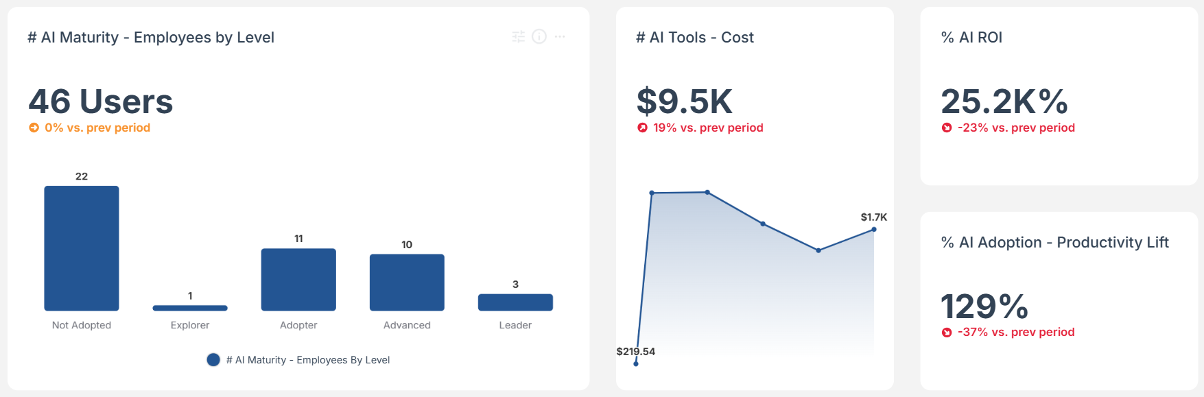
We combine data across the organization, create an enriched company context, understand the relationships between systems and outcomes, and allow the metrics themselves to be deeply customized to the business.
The definitions are open.
The logic can be inspected.
The assumptions can be challenged.
The model can be customized.
The data can be independently validated.
And the resulting metrics can be continuously tested against what is actually happening in the organization.
That is the capability we don't see anywhere else in the market today.
Others can give you a predefined AI adoption score.
Or a developer productivity score.
Or a customer health score.
Or a project risk score.
TargetBoard is built to answer the much harder question:
What should this metric mean for your company, based on your data, your priorities, your definitions, and the decisions you are trying to make?
That distinction becomes more important as metrics become more consequential.
As companies become increasingly data-driven — and increasingly AI-driven — they will create more scores, forecasts, models, agents, and automated recommendations.
The answer cannot be to keep adding simplified metrics on top of fragmented data.
The measurement layer itself has to become smarter.
Metrics need to be:
That is the philosophy behind the new AI Maturity and AI ROI metrics we are releasing at TargetBoard.
But it is also much bigger than these two metrics.
It is a different way of thinking about how an enterprise measures itself.
Because the purpose of a metric is not to produce a number.
It is to create a reliable enough representation of reality that you can confidently make decisions from it.
Anything less can be dangerous.
And that is exactly why we built TargetBoard.ai .
Most AI coding tools can tell you whether they are being used.
You may be able to track active users, adoption rates, suggestions, acceptance rates, generated code, token consumption, or AI-assisted activity.
That information is useful, but it does not tell you whether engineering performance improved.
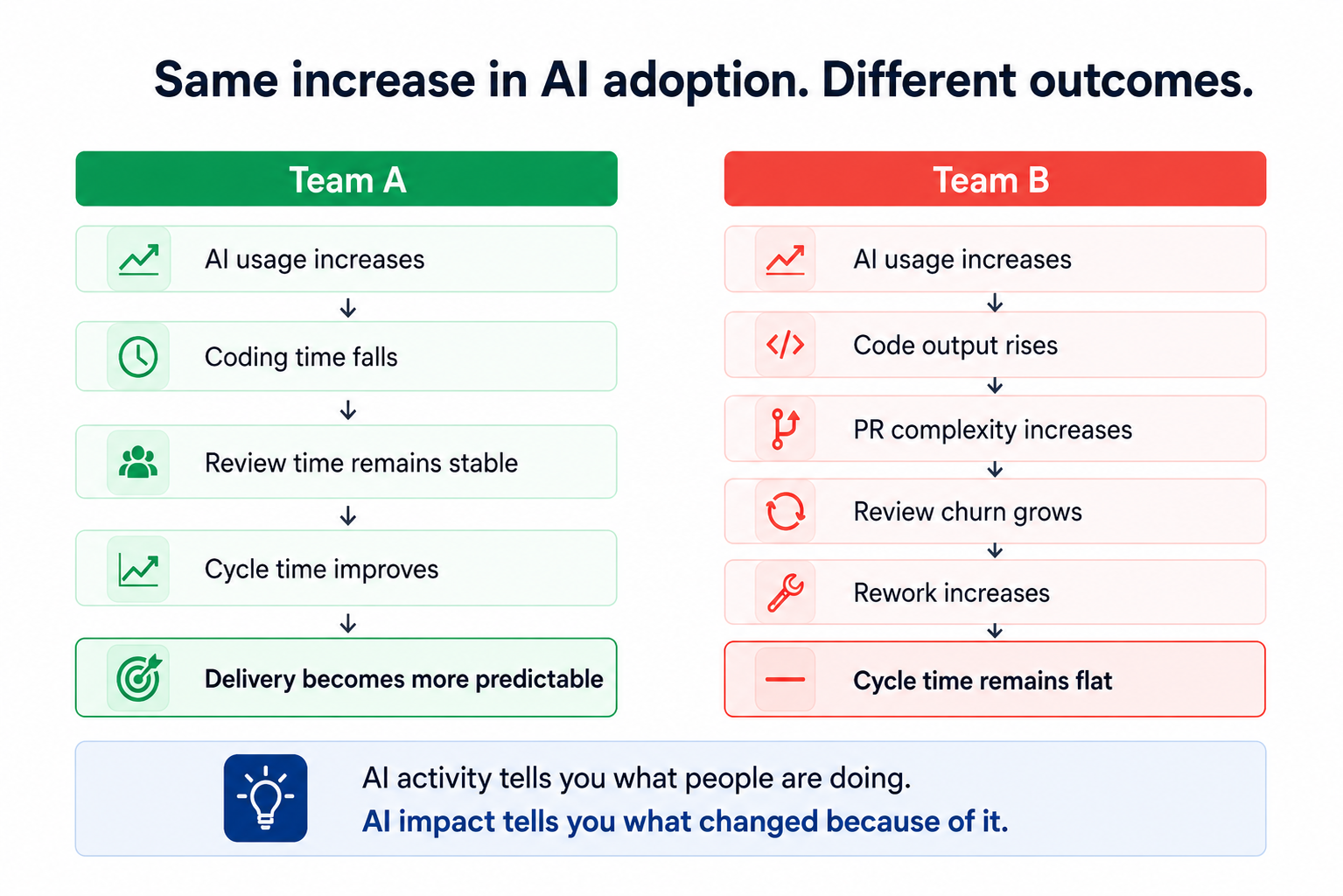
Consider two teams that both significantly increase AI adoption.
Both teams can report successful adoption.
Only one is showing clear evidence of better engineering outcomes.
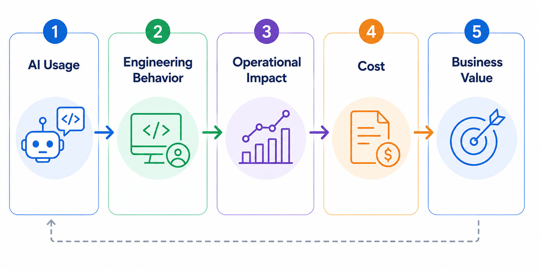
The mistake is jumping directly from adoption to ROI.
High usage does not automatically mean higher productivity, better delivery, or financial return. A more useful model is:
AI may reduce coding time but increase review effort.
It may increase throughput while also increasing rework.
It may deliver significant benefits to one team and almost none to another.
The useful question is not: “How much AI are we using?”
It is: “What happened to engineering performance where AI usage changed?”
Most organizations are not missing the underlying data.
The problem is that each system understands only its own part of the world.
A Cursor usage event does not know what initiative the developer was working on.
A GitHub pull request does not automatically know whether it was AI-assisted.
A Jira ticket does not understand what happened during code review.
An AI license does not tell you if the team using it became more productive.
Take a seemingly simple leadership question:
Answering it reliably may require you to:
Any one of these tasks is manageable.
The complexity comes from keeping all of them correct together.
Teams reorganize. Repositories move. Jira workflows change. AI vendors change. APIs evolve. New leadership questions appear.
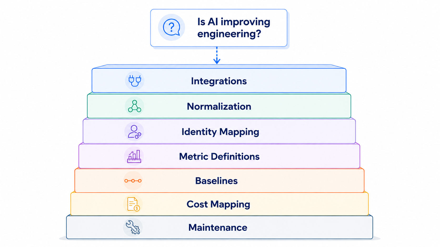
Most engineering organizations have the technical capability to build internal analytics.
APIs, warehouses, transformation tools, BI platforms, internal engineering teams, and increasingly capable AI models are all available.
The question is not whether you can build it.
It is what you want to own.
There is a big difference between connecting Jira and GitHub for a dashboard and maintaining a reliable operational model of the engineering organization.
That model needs to understand relationships between:
And those relationships need to remain accurate as the organization changes.
The internal solution therefore comes with ongoing ownership of connectors, schemas, metric governance, organizational mappings, historical consistency, tool migrations, and analytical logic.
The more useful build-vs-buy question is:
For some organizations, the answer may still be yes.
But it should be a deliberate decision.
A pull request alone can tell you its size, review time, comments, churn, and merge time. Add company context and you can also understand:
That changes the questions leadership can ask.
That is the difference between aggregating engineering data and understanding engineering performance.
Connecting the data still leaves one problem: interpretation.
A dashboard may tell you cycle time increased 18%.
Leadership still needs to determine:
Traditional reporting shows the metric.
Someone still has to explain it.
The next evolution of engineering analytics therefore cannot simply be:
more systems → one dashboard
It needs to be:
Engineering leaders need to understand what changed, what is driving it, and where action is required.
TargetBoard connects data across engineering, planning, AI, organizational, quality, cost, and other company systems while allowing teams to continue working in their existing tools.
That data is normalized into a consistent company context that preserves relationships between people, teams, repositories, work, initiatives, delivery, and outcomes.
On top of that context, domain-expert agents continuously interpret performance to surface what changed, what is driving it, and where risk or opportunity is emerging.
That enables engineering leaders to investigate questions such as:
The goal is not another dashboard. It is removing the data engineering and interpretation work standing between the question and a reliable answer.
AI coding assistants are individual-use tools, so per-seat pricing makes sense.
Engineering intelligence is different.
Its value comes from understanding the organization as a system. A developer does not need to log into an analytics platform for their work to contribute to the operational picture leadership needs.
TargetBoard does not use per-seat pricing.
The objective is organization-wide engineering and AI intelligence, not another product that has to be licensed developer by developer.
Measuring AI impact is technically solvable. The question is how much infrastructure your engineering organization wants to own in order to solve it.
If you build the capability internally, the commitment extends well beyond connecting a few APIs or creating a dashboard. Someone needs to maintain the data model, keep identities and organizational mappings accurate, absorb changes in source systems, preserve historical consistency, and continually adapt the analysis as new AI tools and new leadership questions emerge.
For organizations with highly specific requirements, that investment may be justified.
But for most engineering leaders, the more useful question is whether building and maintaining this measurement layer creates any strategic advantage.
The value is not in owning the pipelines.
It is in being able to answer, with confidence:
Those are management questions, not data-engineering outcomes.
The goal should be to spend less time assembling the evidence and more time using it to make better engineering decisions.
.png)
Most vendor evaluations combine a product demo, a limited developer trial, feature comparisons, and user feedback.
These inputs can show whether a tool is usable, trusted, secure, and compatible with the existing toolchain. They do not establish whether it improves delivery.
A developer may feel faster while using an AI assistant, yet pull requests may still require more review, create more rework, or spend longer waiting to be picked up.
Developer sentiment provides valuable context. Operational data shows what actually changed.
This distinction is particularly important for AI engineering tools. Faster code creation does not automatically lead to faster review, approval, or deployment. A tool may accelerate one stage while moving friction further downstream.
The customer wanted to compare two AI code review automation vendors: Qodo and CodeRabbit.
Rather than testing the tools with unrelated groups or comparing broad company-wide averages, the team used the same defined group of developers throughout the evaluation. Each vendor was tested during a separate period of approximately two weeks.
The methodology was straightforward:
This was not a laboratory experiment. Real engineering environments include differences in repository complexity, work type, team availability, and pull request size.
But it was a structured, real-world comparison that produced stronger evidence than a feature checklist or a collection of opinions.
The objective was not to prove that one vendor is universally better. It was to determine which vendor produced better outcomes in this customer’s environment.
The analysis depended on consistently isolating the developers participating in the POC.
Without a reusable filter, the team would have needed to rebuild the participant group for each metric and evaluation period, slowing the process and increasing the risk of inconsistent comparisons.
Using TargetBoard Saved Filters, the team defined the relevant contributors and pull request creators once, then reused the same cohort across the board.
This made it easier to:
The team could spend less time configuring the analysis and more time interpreting the results.
The customer focused on what happened after code entered the pull request workflow.
This measured the time from the first commit until the pull request was merged.
It provided an end-to-end view of whether work moved more efficiently during each vendor trial. In this evaluation, the Qodo period showed a shorter average cycle time than the CodeRabbit period.
Cycle time should be treated as a system signal. A higher result may reflect delays in pickup, review, coordination, approval, or integration.
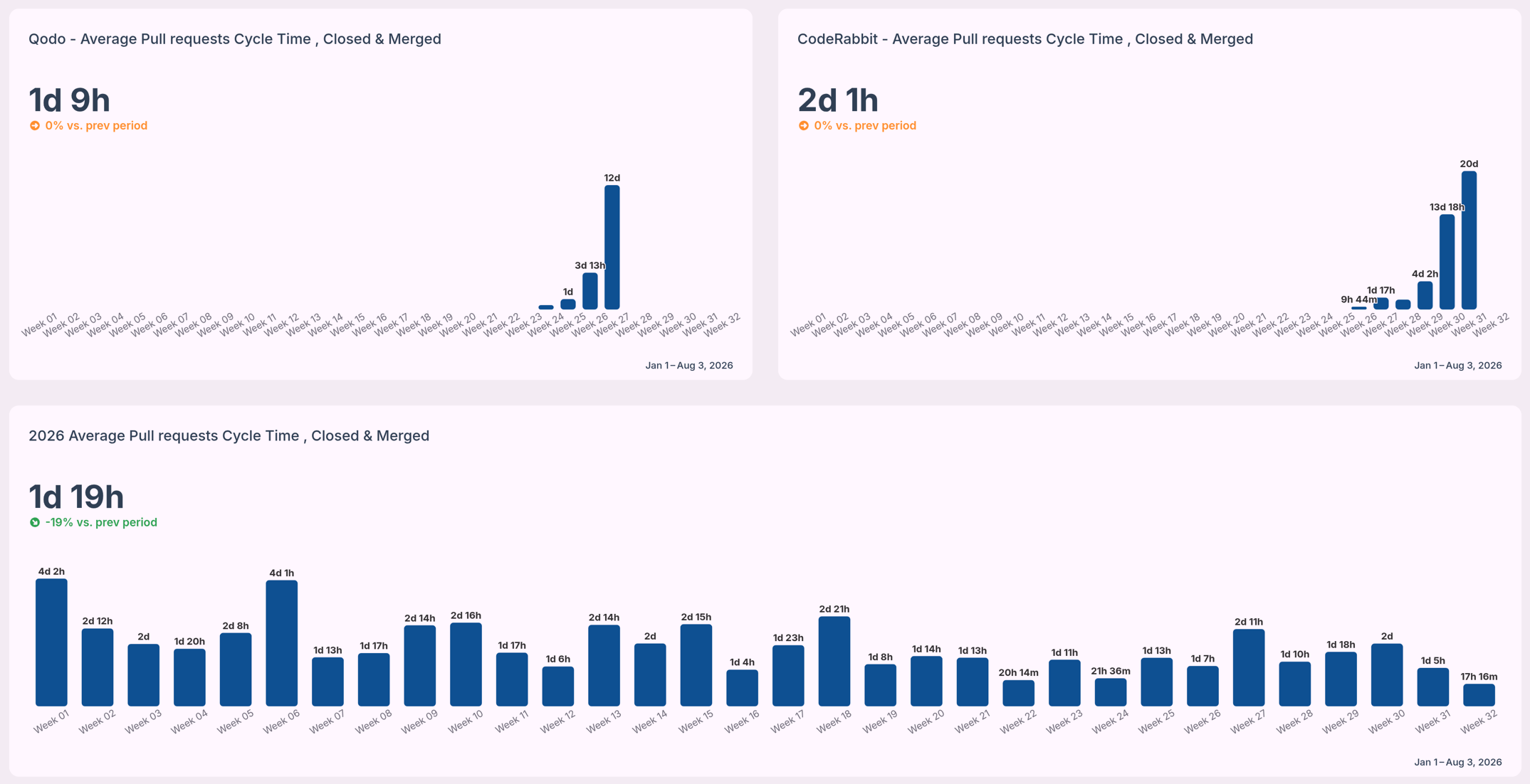
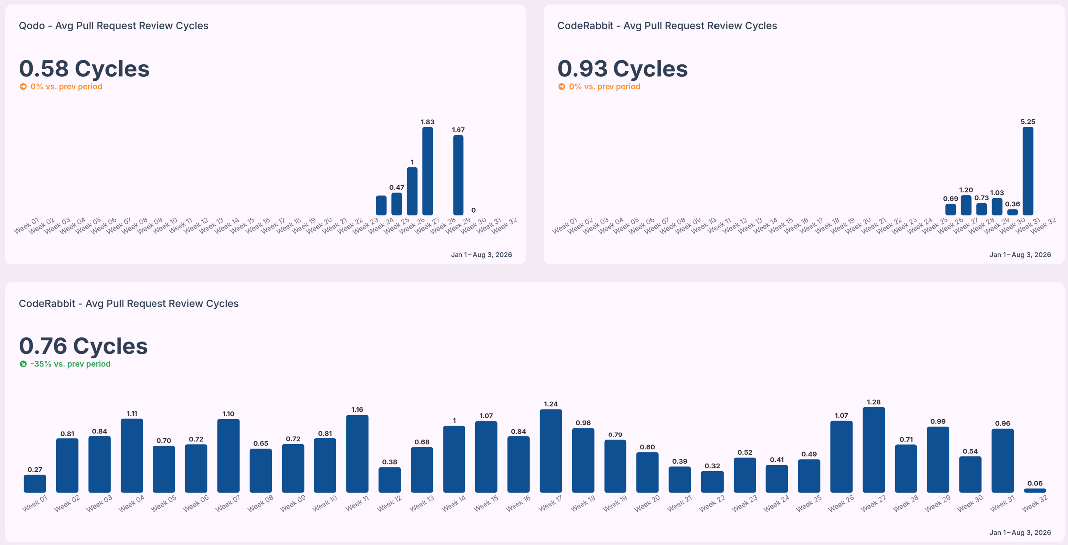
The team also measured how many times a pull request returned to the author for changes before approval.
Fewer review cycles can indicate less back-and-forth and lower review churn. The Qodo period showed fewer average review cycles than the CodeRabbit period.
This was useful evidence, although a full quality assessment would also need to consider defects, incidents, rollbacks, and escaped issues.
Overall cycle time shows that a difference exists. It does not explain where the delay occurred.
The customer therefore examined time spent in stages such as coding, waiting for review, active review, and merge.
This helped distinguish active work from waiting time and showed whether differences came from review pickup, review complexity, or later workflow stages.
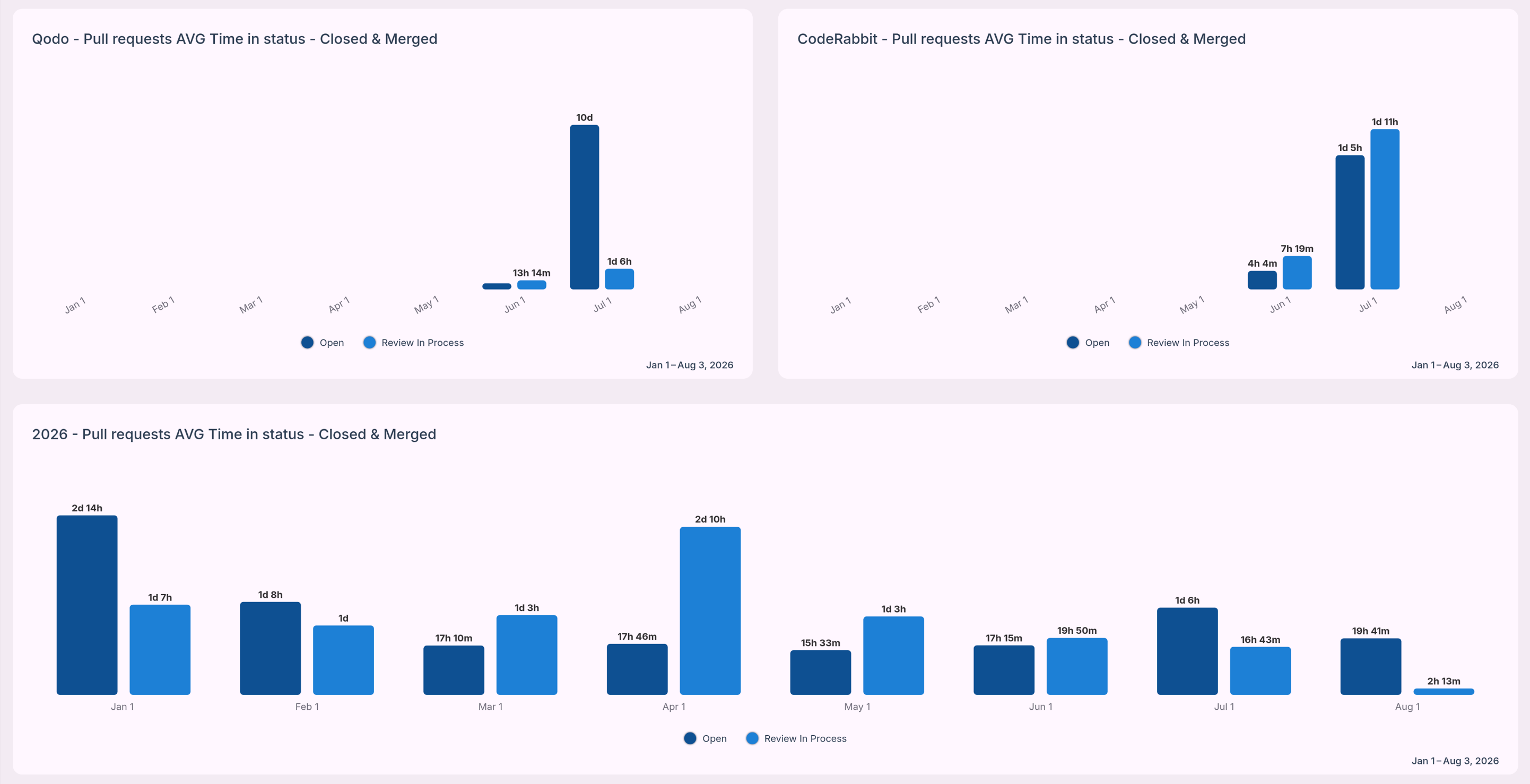
Across the metrics selected for the proof of concept, the Qodo evaluation period showed stronger results than the CodeRabbit period.
The Qodo period recorded:
These results gave the customer a concrete basis for the selection decision.
The team was no longer deciding only which product looked more capable in a demonstration or which tool developers preferred. They could compare how each vendor affected real work inside their engineering system.
The result should remain specific to this customer. It does not establish a universal benchmark for either vendor. The outcome reflected the organization’s developers, repositories, processes, work mix, and evaluation periods.
That limitation does not weaken the analysis. It is what makes the result useful.
The customer needed to know which vendor performed better in its own environment.
A useful AI vendor POC should answer two questions: “Which tool did developers prefer?” and “What changed in the delivery system when the tool was introduced?”.
To build a stronger evaluation:
No single metric should decide the outcome.
A tool may reduce review time while increasing quality risk. Another may receive strong developer feedback but show little measurable effect on delivery. A complete evaluation balances operational outcomes with usability, risk, and cost.
AI engineering vendors should be evaluated on more than features, adoption, and perceived time savings.
The real question is whether a tool improves the flow, quality, and predictability of software delivery.
By testing Qodo and CodeRabbit with a defined group of developers, applying consistent operational metrics, and using TargetBoard Saved Filters to accelerate the analysis, this customer turned a typical POC into a more defensible purchasing decision.
The result was not simply another dashboard. It was a clearer understanding of what changed, where the differences appeared, and which vendor produced the stronger outcome for that organization.
TargetBoard helps engineering leaders compare vendor performance using operational data from their own teams and workflows.
See how TargetBoard can help you build a more objective, repeatable vendor evaluation process.
An ai code review is the process of using Large Language Models to automatically analyze pull requests. These tools scan source code analysis outputs to detect syntax errors and suggest refactoring options before a human reviewer steps in. They excel at identifying boilerplate code issues and enforcing standard automated linters. But they struggle with cross-service dependencies and complex business logic constraints.
The most effective engineering teams treat an ai code reviewer as a high-speed assistant rather than an autonomous decision-maker. AI models lack the operational context to make final architectural decisions. They can't negotiate API contracts or understand why a specific workaround exists for a legacy system.
That means a human-in-the-loop review remains absolutely critical. You use the AI to clear out the noise of code formatting and basic threat detection, so your senior engineers can focus their cognitive energy on system design and business logic.
A major limitation of current AI tools is their reliance on file-level analysis. An AI assistant might review a single pull request and confirm the syntax is perfect. Yet that same code might break cross-service dependencies three layers deep in your application.
This happens because AI context windows face strict VRAM limits and memory constraints, preventing them from holding your entire codebase in memory at once. Trusting AI file-level analysis without verifying the broader repository context is a common mistake that leads directly to architectural drift. Your delivery pipeline must connect code changes to system-wide impacts to prevent this risk.
Yes, a code review ai is highly accurate when evaluating isolated syntax and standard formatting rules. Conversely, accuracy drops to near zero when evaluating complex logic or proprietary frameworks. This drop in precision introduces high rates of false positives and AI hallucinations into your pull requests.
Consider a common scenario where an AI tool successfully identifies a missing variable declaration but completely misses a breaking change in your core payment processing logic. The AI then floods the pull request with dozens of comments about stylistic formatting. Developers end up arguing with an AI bot in the comments over subjective syntax choices, creating massive review churn.
This noise creates an overwhelming backlog for human reviewers and actively slows down sprint velocity. Developer overreliance on these tools compounds the problem. Junior engineers might blindly accept AI suggestions without understanding the underlying code, injecting hidden technical debt into the system. You must measure this friction continuously to ensure the tool is actually accelerating your workflow rather than just generating noise.
Selecting the best ai code review tools requires matching the platform's core capability to your specific workflow bottleneck. You must differentiate between tools that generate code, platforms that scan for vulnerabilities, and systems that measure the systemic impact of those changes.
Tools like CodeRabbit and Qodo focus heavily on pull request summarization. They read the diff and generate a plain-language summary of the changes, so human reviewers can grasp the intent faster. This approach often improves initial time-to-merge metrics for simple tasks.
But open source ai code review tools in this category can struggle when deployed on massive enterprise monorepos. The sheer volume of interconnected files overwhelms the model. This leads to generic summaries that fail to capture the actual architectural impact of the change.
GitHub Copilot and similar IDE extensions operate directly where developers write code. These tools use agentic workflows to suggest entire functions as the developer types. They are incredibly effective at reducing the time spent writing boilerplate syntax.
They operate with a limited view of the broader system. A native extension might suggest a highly efficient sorting algorithm, yet it can't verify if that logic violates broader API contracts established by another team. Human reviewers must still validate those systemic connections.
Enterprise platforms like SonarQube and Greptile focus on strict CI/CD integration. They run deep static analysis to ensure your codebase maintains OWASP compliance and prevents known vulnerabilities from reaching production. These tools are non-negotiable for teams operating in highly regulated environments.
A major consideration in this category is data sovereignty. Sending proprietary enterprise code to external models for security scanning introduces compliance risks. You must configure these tools to ensure sensitive data remains within your controlled infrastructure.
Adopting ai powered code review tools frequently increases raw output while secretly damaging delivery predictability. You need a way to measure this friction. TargetBoard is an agentic operational intelligence platform that helps leadership teams understand how execution is performing, why it is changing, and how to respond.
TargetBoard connects data across company systems and uses domain-expert AI agents to understand workflow bottlenecks. It acts as the essential operational intelligence layer that shows you if your AI coding tools are actually improving sprint velocity or just creating massive review churn.
Implementing ai code reviews requires strict boundaries. You must configure the tool to handle objective rules while reserving subjective architectural decisions for human engineers. If you fail to set these boundaries, the AI will argue with your developers over code formatting and stylistic preferences.
This friction causes massive review churn and slows down your entire pipeline. You must structure the workflow to prevent this noise.
You must map exactly where the AI intervenes in your Software Development Lifecycle. The AI should run its analysis immediately upon pull request creation. It scans for syntax errors, basic code smells, and formatting violations.
The developer resolves these objective flags before a human reviewer is ever assigned to the pull requests. This sequence ensures your senior engineers only spend their time reviewing complex logic and system architecture.
You must train your AI tools using custom rule files specific to your repository. This step prevents the AI from suggesting changes that violate your internal business logic constraints. You can configure the tool to enforce DRY principles and flag code duplication automatically.
The interaction between these custom rule files, the model's context windows, and your code repositories determines the success of the tool. A well-configured rule file reduces false positives and ensures the AI only surfaces actionable insights.
You can't manage what you don't accurately measure. Relying on basic productivity metrics like lines of code written will mislead your leadership team. According to the 2023 DORA Report, true delivery predictability matters far more to business outcomes than raw development speed. You must measure if your ai code review tools are actually accelerating delivery or just shifting the bottleneck.
TargetBoard provides this critical measurement layer. It tracks the difference between AI-generated output and human review times. If an AI tool increases output by 40 percent but causes pull requests to sit in review for three extra days, your actual sprint velocity decreases. TargetBoard exposes these hidden workflow bottlenecks, so you can adjust your strategy based on objective operational intelligence rather than intuition.
The primary value of an AI code review tool is workflow efficiency, not replacing human architectural judgment. These tools are highly effective at clearing out boilerplate errors and enforcing basic code quality. Yet they introduce their own hidden complexities that require continuous systemic measurement.
According to 2024 GitHub Copilot research, AI assistants boost developer productivity by up to 55 percent. You must balance that speed with strict oversight to protect codebase maintainability and prevent the accumulation of technical debt. By running an operational intelligence layer alongside your AI tools, you can safely accelerate software delivery while maintaining complete confidence in your engineering metrics.
.png)
Value stream management (VSM) is an operational framework that connects business objectives to the software delivery lifecycle. The goal is to optimize how work moves from idea to production, helping leaders identify constraints and improve continuous flow. But tracking work is only the first step.
You must connect those tracking metrics to actual customer value and time-to-market outcomes. When you understand how value flows through your organization, you can stop reacting to delayed releases and start proactively removing the barriers that slow your teams down.
To build a reliable value delivery pipeline, you need to understand the foundational rules of the methodology. These principles guide teams toward predictable delivery and continuous improvement.
Applying these concepts to engineering requires a hard look at how your teams actually work. You likely track engineering performance using standard indicators like cycle time, lead time, and deployment frequency. These numbers provide a baseline for your delivery speed.
But a dashboard showing a spike in lead time doesn't solve the underlying problem. You have to trace that metric back to the specific workflow behaviors causing the delay. This requires connecting data across your planning and code systems to see the reality of your operations.
Workflow friction often hides inside routine development tasks. Consider a scenario where your overall cycle time suddenly spikes by 40 percent. The dashboard flags the delay, but it can't tell you that three high-complexity pull requests have been sitting in the review queue for four days.
The code is written, yet cross-team dependencies and unclear ownership prevent anyone from merging it. This code review churn artificially inflates your cycle time metrics. The work itself isn't slow, but the system is blocked. Identifying these specific constraints allows you to clear the path rather than just asking teams to code faster.
Traditional organizations fund temporary projects, which naturally creates organizational silos. Teams assemble, build a feature, and then disband. This breaks execution alignment and leaves no clear owner for long-term maintenance or technical debt.
Modern value stream management requires a shift toward a product-centric model. You fund stable, cross-functional teams that own a specific product from end to end. This structure improves capacity allocation because you align your best engineers with long-term value delivery rather than temporary task lists. The result is a more resilient delivery engine that adapts quickly to market changes.
Implementing this framework requires a structured approach to analyzing your value streams. You need to connect resource planning directly to your value delivery pipeline. This ensures you are solving the right problems instead of just optimizing isolated tasks.
Value stream mapping is the diagnostic tool you use to visualize how work flows through your organization. Follow these four steps to build an accurate map:
To improve flow efficiency, you must identify where engineering effort goes to waste. Modern software leaders face specific capacity concerns that look very different from physical manufacturing. Here is how the classic seven wastes translate to software delivery.
You can map your workflows perfectly, but legacy tools often fail because they rely on metrics without context. You see cycle time shifting, but you can't explain why execution breaks down. According to a 2023 Gartner report on engineering operations, most leaders struggle because their operational data is trapped in data silos.
This forces executives to rely on subjective updates from managers instead of trusted system-level reality. Tracking metrics provides visibility, but it doesn't provide understanding. TargetBoard is an agentic operational intelligence platform that connects data across company systems, interprets performance through operational intelligence, and uses domain-expert AI agents to guide execution decisions.
This shifts your organization from reactively monitoring dashboards to proactively fixing workflow friction. You gain the power to make confident execution decisions based on reality.
Artificial intelligence code generation accelerates output, so it fundamentally alters how work flows through your system. But higher output often introduces hidden delivery risk. For example, artificial intelligence code frequently experiences higher code review churn than human-written code because it requires intense scrutiny to verify complex logic.
If you only measure output volume, you miss the bottleneck forming in your review stage. This hidden complexity slows down the entire pipeline and delays critical execution decisions.
Tracking DevOps Research and Assessment metrics is a good start, but it's only showing you the symptoms of an inefficient system. You need to diagnose the disease through root cause analysis to achieve predictable delivery.
A common mistake in engineering leadership is treating performance metrics as goals rather than lagging indicators of system health. According to the 2023 Forrester Report on software delivery, teams that focus purely on metric targets often sacrifice long-term stability. When you stop chasing numbers and start focusing on resolving the underlying workflow constraints, your delivery confidence naturally improves.
This operational shift connects daily engineering tasks directly to broader business outcomes. By treating visibility as a starting point rather than the finish line, you create a culture of continuous improvement that actually scales. Understanding your system gives you a clear framework for your next planning session or your next board meeting.
Value stream management (VSM) is an operational framework that connects business objectives to the software delivery lifecycle. The goal is to optimize how work moves from idea to production, helping leaders identify constraints and improve continuous flow. But tracking work is only the first step.
You must connect those tracking metrics to actual customer value and time-to-market outcomes. When you understand how value flows through your organization, you can stop reacting to delayed releases and start proactively removing the barriers that slow your teams down.
To build a reliable value delivery pipeline, you need to understand the foundational rules of the methodology. These principles guide teams toward predictable delivery and continuous improvement.
Applying these concepts to engineering requires a hard look at how your teams actually work. You likely track engineering performance using standard indicators like cycle time, lead time, and deployment frequency. These numbers provide a baseline for your delivery speed.
But a dashboard showing a spike in lead time doesn't solve the underlying problem. You have to trace that metric back to the specific workflow behaviors causing the delay. This requires connecting data across your planning and code systems to see the reality of your operations.
Workflow friction often hides inside routine development tasks. Consider a scenario where your overall cycle time suddenly spikes by 40 percent. The dashboard flags the delay, but it can't tell you that three high-complexity pull requests have been sitting in the review queue for four days.
The code is written, yet cross-team dependencies and unclear ownership prevent anyone from merging it. This code review churn artificially inflates your cycle time metrics. The work itself isn't slow, but the system is blocked. Identifying these specific constraints allows you to clear the path rather than just asking teams to code faster.
Traditional organizations fund temporary projects, which naturally creates organizational silos. Teams assemble, build a feature, and then disband. This breaks execution alignment and leaves no clear owner for long-term maintenance or technical debt.
Modern value stream management requires a shift toward a product-centric model. You fund stable, cross-functional teams that own a specific product from end to end. This structure improves capacity allocation because you align your best engineers with long-term value delivery rather than temporary task lists. The result is a more resilient delivery engine that adapts quickly to market changes.
Implementing this framework requires a structured approach to analyzing your value streams. You need to connect resource planning directly to your value delivery pipeline. This ensures you are solving the right problems instead of just optimizing isolated tasks.
Value stream mapping is the diagnostic tool you use to visualize how work flows through your organization. Follow these four steps to build an accurate map:
To improve flow efficiency, you must identify where engineering effort goes to waste. Modern software leaders face specific capacity concerns that look very different from physical manufacturing. Here is how the classic seven wastes translate to software delivery.
You can map your workflows perfectly, but legacy tools often fail because they rely on metrics without context. You see cycle time shifting, but you can't explain why execution breaks down. According to a 2023 Gartner report on engineering operations, most leaders struggle because their operational data is trapped in data silos.
This forces executives to rely on subjective updates from managers instead of trusted system-level reality. Tracking metrics provides visibility, but it doesn't provide understanding. TargetBoard is an agentic operational intelligence platform that connects data across company systems, interprets performance through operational intelligence, and uses domain-expert AI agents to guide execution decisions.
This shifts your organization from reactively monitoring dashboards to proactively fixing workflow friction. You gain the power to make confident execution decisions based on reality.
Artificial intelligence code generation accelerates output, so it fundamentally alters how work flows through your system. But higher output often introduces hidden delivery risk. For example, artificial intelligence code frequently experiences higher code review churn than human-written code because it requires intense scrutiny to verify complex logic.
If you only measure output volume, you miss the bottleneck forming in your review stage. This hidden complexity slows down the entire pipeline and delays critical execution decisions.
Tracking DevOps Research and Assessment metrics is a good start, but it's only showing you the symptoms of an inefficient system. You need to diagnose the disease through root cause analysis to achieve predictable delivery.
A common mistake in engineering leadership is treating performance metrics as goals rather than lagging indicators of system health. According to the 2023 Forrester Report on software delivery, teams that focus purely on metric targets often sacrifice long-term stability. When you stop chasing numbers and start focusing on resolving the underlying workflow constraints, your delivery confidence naturally improves.
This operational shift connects daily engineering tasks directly to broader business outcomes. By treating visibility as a starting point rather than the finish line, you create a culture of continuous improvement that actually scales. Understanding your system gives you a clear framework for your next planning session or your next board meeting.
.png)
Understanding flow metrics means looking at how value moves from an initial idea to time-to-revenue. These metrics track work across the end-to-end value stream to help leaders spot hidden blockages before they impact delivery predictability. They provide clear signals about where workflow friction occurs, so you can diagnose system stress instead of blaming individual developers.
The 4 key flow metrics provide a foundational view of delivery health and system capacity.
The flow framework metrics defined by Dr. Mik Kersten offer a more specific lens for analyzing engineering performance signals.¹
Teams shipping 50+ deployments a week boast excellent DORA scores while struggling with terrible software delivery predictability. A team might deploy multiple times a day, yet their overall flow load is massive and critical features are constantly delayed.
This happens because DORA relies on point-in-time metrics that measure output events rather than the continuous progression of work across the development lifecycle. DORA shows you how fast you ship, while flow metrics reveal how work actually moves. Relying solely on speed creates proxy metrics limitations that hide the true cost of context switching.
DORA metrics focus purely on deployment speed and operational stability, originally established by the DevOps Research and Assessment team.²
DORA metrics and flow metrics act as complementary engineering performance signals. DORA measures the final mechanical steps of software delivery, focusing entirely on speed and stability. Measuring flow focuses on the entire value stream, tracking how work moves through cross-team dependencies from planning to execution.
When you combine both, you can see the delivery tradeoffs teams make. For example, a team might inflate deployment frequency by shipping tiny updates while larger feature requests rot in the backlog. Flow metrics expose these behaviors, giving leaders the context needed to make confident capacity decisions.
Identifying execution bottlenecks requires shifting from passive observation to active capacity allocation. When you spot workflow friction, you need a systematic approach to clear it and drive continuous improvement.
One of the most common bottlenecks occurs during the code review process. When you analyze wait time vs. active time, you often find that pull requests sit idle for days before receiving a review. This delay usually stems from subjective review decisions or massive PR sizes that intimidate reviewers.
Tracking Work Item Age helps you spot these stalled reviews early, allowing you to step in and facilitate delivery risk mitigation. By addressing code review risk directly, you prevent minor delays from snowballing into missed release dates. Tracking a specific pull request's age recently helped one engineering team prevent a critical release delay by highlighting a PR stuck in an endless, subjective review loop.
High Work in Progress directly correlates with reduced throughput. When Flow Load spikes, teams spend more time context-switching than actually writing code. You need system-level visibility to enforce strict WIP limits and stabilize the delivery pipeline.
AI tools allow developers to generate code faster than ever, yet this speed often creates throughput anomalies. You might see a massive increase in tickets closed, so you assume productivity is up. This artificial output spike often hides a surge in AI-generated code complexity.
Reviewers simply can't keep up with the volume. This bottleneck tanks flow efficiency and causes massive rework churn. You end up with a pipeline stuffed with code that is fast to write but incredibly slow to review, test, and merge.
Cycle time and throughput act as trailing indicators. By the time they show a slowdown, the damage is already done. AI accelerates the creation of new features, but it also accelerates technical debt accumulation. When developers push complex AI-assisted pull requests, they introduce hidden complexity into the codebase.
Over time, your team spends more time fixing bugs than building features. This shifts your capacity from value demand to failure demand, slowly strangling your delivery pipeline. You need visibility into code complexity before it merges, or your future delivery predictability will collapse.
Flow metrics are incredibly useful for spotting system stress, but optimizing for them in isolation creates a massive blind spot. Frameworks provide signals. They do not provide understanding. A metric dashboard might tell you that cycle time is up, but it can't explain that three high-complexity AI-generated pull requests are stalled in code review.
When you rely on data silos and fragmented reporting, executive decision-making becomes a guessing game. Leaders see the numbers shift but can't explain why, which erodes trust across the organization. To fix this, you must bridge the gap between static measurement and operational intelligence.
TargetBoard is an agentic operational intelligence platform that helps leadership teams understand how execution is performing, why it is changing, and how to respond. It connects cross-system data to continuously analyze performance, translating raw signals directly into decision-centric execution actions.
You can't achieve predictable delivery by simply staring at charts. True execution alignment requires connecting your planning data directly to your codebase. When you rely solely on passive measurement across the software delivery lifecycle, you risk optimizing the wrong things. Some teams even game throughput by breaking tickets into artificially small chunks without actually improving value delivery.
The mathematical realities of Little's Law dictate that cycle time equals work in progress divided by throughput. If you allow work in progress to expand indefinitely, cycle time mathematically must increase. You must shift from reporting on the past to predicting the future, using active intelligence to manage flow load and guide your daily operations.
.png)
Developer experience defines the operational reality of how engineers interact with your technical infrastructure to build and ship code. It measures the level of friction in daily workflows and directly impacts software delivery performance. A poor dev experience means your team spends more time fighting internal systems than solving actual business problems.
Board members and C-suite leaders often mistakenly treat what is developer experience as a cultural or HR initiative focused on office perks. You must treat developer experience as the UX for your engineering team. If the internal systems are slow or siloed, your team can't ship predictably.
You might notice a high-complexity pull request sitting in review for multiple days. That isn't a motivation problem. It's pure organizational drag caused by poor system design.
A good Developer Experience (DX) means your team can focus on execution without hitting hidden bottlenecks. Engineering effectiveness drops the moment developer friction increases. You can evaluate the health of your environment by looking at three specific operational pillars that dictate how work actually flows through your systems.
Fast feedback loops are critical for maintaining engineering momentum. Engineers need to know immediately if their code breaks the build. Long build and deployment times force developers to wait, so they lose context and switch to other tasks.
You must optimize your continuous integration and delivery pipelines to return results in minutes. Automated environment setups eliminate manual configuration errors and reduce wait times from hours to minutes. If your continuous integration cycle time exceeds ten minutes, you are actively burning engineering capacity and delaying your release schedule. Fast cycle times are usually a healthy signal, but you must ensure they don't indicate a lack of proper code review.
High cognitive load means your engineers spend more time deciphering complex architecture than writing functional code. Systemic complexity grows silently, and legacy system navigation quickly becomes a major bottleneck for new and existing staff. You can audit this burden using a structured approach to uncover hidden inefficiencies.
Engineering requires deep focus to achieve a productive flow state. Context switching destroys that focus instantly. Every broken pipeline alert or fragmented toolchain forces a developer to drop their current mental model, and regaining that focus takes up to 20 minutes per interruption.
This friction often stems from poor code review practices. Large pull request size and complexity mean reviews take days instead of hours. The author must switch back to the code long after they wrote it, and the reviewer has to dedicate half their afternoon just to understand the changes. Keeping pull requests small and focused protects flow state and accelerates delivery predictability.
When delivery slows down, leaders often look at output metrics instead of workflow inefficiencies and rework. You must identify where developer friction originates to fix the underlying system. Unstable or low-quality code forces engineers into constant firefighting loops, so they spend less time shipping new features and more time managing technical debt.
Generative AI fundamentally changes how your teams build software. The AI impact is massive because the difference between AI-generated vs. human-written code creates a false sense of speed. According to a 2024 GitHub report on AI adoption, an engineer can generate hundreds of lines of code in seconds, but that volume introduces hidden systemic complexity.
This surge in output overwhelms code reviewers and directly causes up to 3x the normal code review churn. The initial velocity looks great on paper, but the downstream reality is a bottleneck of untested logic. AI accelerates output, but it inherently introduces hidden systemic risks if your tooling cannot parse and manage that complexity.
You can't fix systemic issues by only treating the symptoms. Use this framework for root cause analysis to identify exactly where your delivery engine is breaking down.
Engineering leaders often rely on standard benchmarks like DORA metrics or the SPACE framework to track software delivery performance. According to the authors of the SPACE framework in 2021, productivity requires a balanced view of multiple dimensions. According to the 2023 DORA Report, high performers optimize for both speed and stability. These frameworks provide highly valuable signals, but they come with severe practical limitations.
They reveal that performance is changing, but they completely fail to explain why it's changing. Relying purely on lagging metrics or subjective developer sentiment surveys creates blind spots around hidden AI complexity and workflow bottlenecks. You need an operational intelligence layer to connect siloed engineering data and transform those subjective feelings into objective signals.
TargetBoard is an agentic operational intelligence platform that helps leadership teams understand how execution is performing, why it is changing, and how to respond. It creates an operational intelligence layer between data systems and execution. TargetBoard connects fragmented data across planning, code, and delivery systems to surface real-time execution risks before they disrupt predictability.
You need both subjective feelings vs. objective signals to get a complete picture of your engineering operations.
Moving from passive observation to active engineering operations requires a shift in how you use data.
Fixing your environment requires intentional investments in tooling and infrastructure. You must consolidate fragmented tools into internal developer platforms that reduce cognitive load. Proper toolchain integration ensures that data flows smoothly across your organization, so developers don't have to jump between five different applications to complete a single task.
A developer experience engineer builds and maintains the internal tools that keep your delivery engine running. They focus on creating self-service capabilities that allow engineers to provision environments without waiting on IT tickets. This role directly reduces developer onboarding time and eliminates the manual toil that causes burnout.
You can audit your current operations to uncover hidden inefficiencies. Follow these steps to align your engineering practices with delivery predictability.
Mastering developer experience gives you a clear framework to control your software delivery lifecycle. You can stop reacting to delayed releases and start managing the actual workflow friction that slows your teams down. Connecting your fragmented data into a unified operational model protects your engineering effectiveness.
Understanding these patterns gives you the confidence to allocate resources accurately and forecast delivery timelines. You can now present objective operational data to your board and explain exactly why performance is changing, which transforms your engineering organization into a resilient and predictable delivery engine.
.png)
Why Good Release Metrics Mask System Degradation
Measuring software quality at the exact moment of delivery leaves engineering leadership entirely unaware of impending production failures. Teams rely heavily on release-day validation to confirm that code meets baseline standards. They look at pass rates and approve the merge. The problem is that these snapshot metrics only prove the code functions in a controlled environment at a specific point in time.
A release might ship with 90% code coverage and clean static analysis, yet trigger a massive spike in incidents and severe rework just two weeks later. This happens because static checks can't account for the compounding friction that new code introduces to the broader system. Over time, this hidden technical debt erodes delivery confidence and forces teams to spend cycles fixing what they just built. True quality is an ongoing observation of post-release degradation, not a one-time check at the finish line.
Modern development tools have fundamentally changed how work is produced. Engineers now use AI assistants to write massive amounts of code in minutes. This accelerates initial code commits, but it exponentially increases pull request size and review churn. Reviewers struggle to mentally parse the sheer volume of logic generated by machines. This creates severe engineering drag across the delivery pipeline.
The AI-generated code impact looks great on a velocity chart, yet it quietly introduces code complexity and maintainability risks that bypass standard quality gates. Syntactically correct code often introduces subtle architectural flaws that only surface under live production loads.
People often ask how to measure software code quality when they actually need to measure system health. Engineering teams must separate how they validate code from how they evaluate system behavior. Code validation happens during the software development lifecycle before a merge. It relies on static code analysis to catch syntax errors and security vulnerabilities. This is a necessary step, but it's entirely localized.
System behavior measures how that code interacts with existing infrastructure, user traffic, and cross-team dependencies after deployment. When teams confuse validation with behavior, they optimize for merging code rather than running stable systems. This misalignment directly causes code review bottlenecks and unpredictable delivery cycles.
To measure code quality accurately at the validation stage, teams track three core indicators of codebase health. These metrics catch obvious structural flaws during active development.
Efficiency metrics evaluate how well the application uses resources and resists failure once code moves closer to deployment.
When evaluating what the key quality indicators are for modern systems, engineering leaders must look past the release date. True software quality metrics track post-release behavior over a sustained period. This reveals the actual system stability and fragility that snapshot metrics miss. Focusing on these four indicators provides the delivery predictability required to align engineering output with business goals.
Software reliability is defined by how the system handles continuous user behavior over time. To measure this, track these specific signals:
Workflow friction is a massive hidden indicator of poor quality. According to Stripe's Developer Coefficient report, engineers already spend up to 42% of their workweek dealing with maintenance, rework, and bad code. When teams adopt AI code generation, they often see an explosion in pull request complexity that compounds this baseline friction. The initial commit happens instantly, yet the subsequent review process drags on for days. This creates severe coordination gaps and forces developers into endless cycles of rework. If engineers spend more time fixing recent commits than building new features, the system's underlying quality is degrading regardless of what the test coverage says.
When a system fails, the speed of restoration matters more than the failure itself. Monitor these operational signals:
Industry frameworks like DORA metrics provide useful lagging signals for delivery speed and stability. They track deployment frequency, lead time for changes, and the change failure rate. But leaders often make the mistake of treating these metrics as a complete measure of developer productivity rather than a set of lagging delivery signals.
High deployment frequency can actually inflate perceived software quality artificially while masking a deteriorating time-to-restore service. A team might ship ten times a day, yet if every release requires hotfixes, the speed is a liability. DORA metrics tell you what happened, so you must pair them with deep operational context to understand why it happened.
To transition from snapshot validation to system-level outcomes, you need a structured approach that tracks performance over time. Standard frameworks provide signals, but they lack the cross-system understanding required to maintain execution alignment.
To implement a time-based framework, follow these core steps.
Engineering leaders constantly face the operational pain of attempting to manually correlate data from different systems to explain a drop in velocity to the board. You know the metrics look great at release, yet the system degrades weeks later. The data required to understand this degradation is fragmented across Jira, GitHub, and production logs. This manual reporting overhead traps leaders in a reactive state, leaving them with weak decision-making signals and eroding trust in engineering reporting.
The bottleneck is no longer visibility, but cross-system understanding. Because AI-assisted development generates massive data with hidden complexity, organizations need an active metric intelligence layer. TargetBoard is an agentic operational intelligence platform that connects data across company systems, interprets performance continuously through operational intelligence, and uses domain-expert AI agents to translate insights into decision-ready inputs that guide execution. It complements standard code validation by explaining exactly why performance is changing, ensuring operational intelligence drives every decision.
To eliminate data silos and achieve true execution alignment, you must unify your signals.
According to the Consortium for Information & Software Quality, the cost of poor software quality in the US reached $2.41 trillion in 2022. Much of this cost stems from unmanaged technical debt and hidden cross-team dependencies. Software quality measurement is not about penalizing individual developers or obsessing over static pass rates. It's about understanding how work flows through your systems and how it behaves in production.
When you shift from snapshot metrics to continuous operational intelligence, you regain delivery confidence. Understanding these post-release patterns gives you a clear framework for your next architectural decision or your next board presentation. You can finally stop reacting to broken releases and start proactively aligning your engineering execution with your business goals.
.png)
In the dynamic landscape of technology startups, the reliance on external outsourcing, offshore teams, or agency support is increasingly common. Whether it's for development, product management, QA, IT, support, or marketing, these partnerships can be pivotal. However, aligning the interests of your company with those of your service providers is a nuanced challenge. This article explores the importance of tracking partner performance and how TargetBoard simplifies this crucial task.
Tech startups often turn to external talent for several reasons:
1. Talent Acquisition Challenges: Finding the right talent locally can be tough, prompting companies to look beyond their borders.
2. Cost Reduction: Outsourcing can be a cost-effective solution compared to local hiring.
3. Rapid Scaling: Startups needing to grow quickly often find that external teams provide the necessary bandwidth.
4. Organizational Diversity and Liquidity: Bringing in external teams can introduce fresh perspectives and flexible structures.
Despite the benefits, a significant challenge remains: aligning your company's interests with those of your service providers. Often, these providers are driven by their own goals, primarily maximizing profit, which can sometimes conflict with the needs of their clients.
- A development agency might prioritize quick delivery over quality, leading to technical debt.
- A marketing firm could focus on short-term gains instead of building a sustainable brand strategy.
- IT support services might offer solutions that require constant maintenance, ensuring ongoing dependency and revenue.- An implementation specialist as a premium partner for a major CRM or Cloud might elect to implement a costly or overkill solution.
Keeping tabs on the performance of your partners is not just beneficial; it's essential. It fosters honest conversations, enables better evaluation and planning, and allows for a comparative analysis of various providers. Unfortunately, many companies lack the tools and systems to effectively monitor this performance.
TargetBoard revolutionizes how tech startups can manage and evaluate their external partnerships. With its user-friendly interface and comprehensive metrics, TargetBoard offers a seamless solution for comparing partners, consultants, and agencies against each other and even against your in-house teams.
.png)
Effective project management is crucial, especially for tech startups in their growth stage. Despite its importance, many companies overlook this aspect, often entrusting product or development managers with the task without specialized support. This approach, however, overlooks the complexities involved in tracking Key Performance Indicators (KPIs) of a project.
KPIs are essential for measuring the success and efficiency of a project. However, tracking these metrics can be challenging. Data availability, accuracy, and timeliness are common issues. Moreover, companies often recognize the need for KPI tracking after a project has already commenced, leading to retroactive planning and data collection.
A significant consequence of not tracking project KPIs effectively is the lack of visibility into a project's progress. This opacity creates friction among management team members and leads to a considerable waste of time. Managers often find themselves in a constant hustle to compile and present KPIs ad-hoc, multiple times a day. This process not only consumes valuable time but also impedes efficient communication within the team.
In the realm of project management, several KPIs are crucial for monitoring progress and success. These include:
1. Project Completion Rate: Measures the percentage of projects completed within the stipulated timeframe.
2. Budget Variance: Tracks the difference between the budgeted and actual cost of the project.
3. Scope Creep: Monitors any changes or expansions in project scope beyond the original plan.
4. Resource Utilization: Assesses how efficiently resources (both human and material) are used.
5. Milestone Achievement: Tracks the completion of key stages within the project timeline.6. Team Performance: Evaluates the productivity and efficiency of the team members.
Managing multiple projects adds further complexity. Each project may have different KPIs and tracking requirements, making a unified system like TargetBoard essential for coherent and efficient management.
TargetBoard simplifies the process of tracking these KPIs. It integrates seamlessly with existing systems, providing immediate and hassle-free access to essential project metrics. This accessibility is crucial for making informed decisions and keeping projects on track.
TargetBoard is designed to be adaptable. It can be used at any stage of a project, allowing for retroactive data filling and redefining project scopes based on accurate, up-to-date information.Tracking KPIs is a fundamental part of successful project management. TargetBoard offers a streamlined, comprehensive solution, ensuring that project managers have the data they need to guide their projects to successful completion. This tool is indispensable for companies aiming to enhance their project management capabilities and achieve better outcomes.
.png)
Problem: Teams often prioritize short-term deadlines over sustainable software architecture to meet immediate market demands. This creates hidden structural compromises within the codebase.
Solution: Engineering leaders must treat this deferred maintenance as a measurable business liability that directly impacts engineering velocity and resource allocation.
Software developer Ward Cunningham coined the financial analogy of technical debt to explain this dynamic. Borrowing time to release faster is a perfectly acceptable business strategy, but you incur interest on that loan.
You must pay down the principal through regular software maintenance. If you fail to do this, the compounding interest eventually paralyzes the engineering team. Every new feature requires modifying fragile code, so the cost of future changes becomes prohibitively expensive.
Unmanaged debt inevitably causes critical missed delivery targets. A VP of Engineering might commit to a Q3 product launch based on current team capacity. But technical drag from a legacy billing module quickly causes endless pull request churn.
Developer productivity plummets as engineers spend weeks untangling fragile logic instead of building new capabilities. The result is severe system instability and missed business outcomes. Slower feature releases give competitors the advantage and directly impact revenue pacing.
Engineering leaders categorize tech debt by analyzing the intent behind the decision and the context in which it occurs. This framework helps teams distinguish between strategic technical tradeoffs and simple carelessness.
This occurs when a team explicitly knows the right way to build a feature but chooses the wrong way just to meet short-term deadlines. They might hardcode values or skip essential automated testing entirely.
The team makes these technical tradeoffs without any plan to fix the underlying issues later. This behavior signals a toxic engineering culture and guarantees future delivery failures.
Strategic leaders use this category as a calculated business lever. A team might choose a monolithic architecture over microservices to test a minimum viable product and accelerate time-to-market.
The leadership team understands the limitations and actively schedules future sprints to pay down the debt once the product proves its value. This approach aligns engineering efficiency directly with positive business outcomes.
This debt accumulates when teams simply don't know any better. A junior engineering team might build a complex feature without understanding the design patterns required to scale it.
The resulting code is sloppy and introduces massive operational overhead. Leaders must address this through better training, stricter review processes, and improved engineering efficiency standards.
Even the most talented teams accumulate this debt over time. You might build a brilliant system using the best available practices, but industry standards evolve and user demands shift two years later.
The original design no longer fits the current reality. This impacts codebase health and turns previously modern applications into legacy systems. The result is rising pull request churn as engineers struggle to adapt the old code to new requirements.
The rapid adoption of AI coding assistants fundamentally changes how organizations accumulate risk. AI tools allow developers to generate thousands of lines of code in seconds, so this massive spike in output creates a severe bottleneck downstream.
Human reviewers can't match the pace of the machine. AI doesn't necessarily write bad code, but it dramatically increases code complexity. Developers often accept AI suggestions without fully understanding the underlying logic, and this introduces hidden vulnerabilities.
This dynamic forces human reviewers to spend days deciphering convoluted pull requests. The operational overhead skyrockets, and codebase health deteriorates rapidly. You can't solve this modern friction with legacy metrics.
Engineering leaders can't fix every imperfect line of code. You must treat technical debt reduction as an ongoing resource allocation exercise. According to a 2022 McKinsey report, developers spend approximately 30% of their time managing technical debt1. A 2018 Stripe Developer Coefficient study found that engineers lose up to 17 hours a week to software maintenance and bad code2.
You can't afford that level of waste, so you need a systematic approach to identify which infrastructure debt actually threatens your business. Use this step-by-step guide to evaluate and prioritize your refactoring efforts:
You might track a drop in sprint velocity, but that metric alone doesn't reveal the root cause of the slowdown. A common leadership mistake is tracking metrics without contextualizing the underlying workflow bottlenecks.
A single complex pull request can cause severe code review delays, which blocks multiple engineers and creates a cascading delay across cross-team dependencies. You must perform a root cause analysis to understand exactly where the friction lives. Connecting code complexity directly to cycle time delays gives you the objective data needed to prioritize fixes before they derail your release schedule.
Engineering leaders struggle to justify debt to non-technical stakeholders because they lack objective data connecting code quality to business outcomes. Fragmented data across Jira and GitHub erodes trust in the boardroom. You are left relying on intuition rather than concrete signals to defend your resource allocation.
Standard frameworks and Agile methodologies provide signals of a slowdown, but they don't provide an understanding of the underlying causes when operating at scale. To properly evaluate operational friction and justify refactoring, leaders must implement an operational intelligence layer.
TargetBoard is an agentic operational intelligence platform that helps leadership teams understand how execution is performing, why it is changing, and how to respond. It connects data across company systems, interprets performance through operational intelligence, and uses domain-expert AI agents to guide execution decisions.
Everyone who touches the product lifecycle shares responsibility for it. Product managers create debt when they push unrealistic deadlines without consulting engineering constraints. Developers create it when they skip technical documentation or ignore established coding standards.
Leadership ultimately owns the debt because they control the culture and the budget. You must foster an environment where engineering efficiency balances perfectly with speed to market. When you treat debt as a shared business reality, teams can openly discuss tradeoffs without fear of blame.
You can't walk into a board meeting and ask for a month to clean up bad code. You must frame the initiative around risk mitigation and delivery tradeoffs. Follow this step-by-step guide to build a compelling executive case:
Understanding these patterns gives you a clear framework for your next resource planning session. You no longer have to wait for a major outage to address technical entropy. You can monitor codebase health continuously and catch bit rot before it impacts your customers.
Start by auditing your current reporting systems to see if they actually explain why performance is changing. Move away from manual data aggregation and implement an intelligence layer that connects code complexity to delivery outcomes. This shift allows you to stop reacting to delayed releases and start driving predictable execution across your entire engineering organization.
.png)
Code churn refers to the percentage of a developer's code that gets rewritten, modified, or deleted shortly after being written. Teams typically measure this within a strict 3-week timeframe. If an engineer writes a function and rewrites it two days later, that action is code churn.
When you ask what is code churn, the answer lies in your version control systems. These systems track the exact lines added, modified, and deleted before code reaches production. High churn over a short period indicates that the code was not stable upon its first commit.
You calculate churn code by dividing the number of lines modified or deleted within a specific period by the total number of lines added during that same period. You then multiply the result by 100 to get a percentage.
Here is how you calculate code rework step by step:
Keep in mind that commit frequency alone doesn't equal churn. A developer might commit frequently to save progress without rewriting the same lines of code.
Code churn isn't inherently bad. It is a natural part of the software development lifecycle. The goal is not to eliminate it, but to differentiate healthy prototyping from destructive rework.
Healthy churn happens during the initial design phase when engineers iterate on complex problems. Destructive rework happens when developers constantly rewrite code due to unclear requirements or accumulating technical debt. This unhealthy behavior creates workflow bottlenecks that delay delivery.
Consider a scenario where a team is updating an aging payment gateway. Working with legacy code naturally requires trial-and-error coding. A developer submits a pull request, and the reviewer requests multiple architectural changes because the original product requirements were vague.
The developer spends the next four days rewriting the same 500 lines of code. This is review churn. It isn't a developer defect, but a systemic issue caused by poorly defined upstream requirements. The engineering effort is wasted, so the entire sprint slows down.
A 5% churn rate is exceptionally low and generally indicates a highly stable, well-understood codebase. Industry research from LinearB1 suggests that a healthy churn threshold sits around 20% for most engineering teams. Appfire2 confirms that exceeding this limit often points to systemic process failures rather than individual coding errors.
But a single baseline doesn't apply universally. A team building a new product from scratch will naturally see higher churn than a team maintaining an established application. You must establish a baseline based on historical engineering metrics for each specific project. If a team's baseline is 15% and it suddenly spikes to 40%, you have a clear signal that sprint velocity is about to drop.
A sudden spike in code rework is a symptom of a deeper operational failure. You must perform a root cause analysis to understand why engineers are rewriting their work. If you ignore the underlying issues, you will see an increase in software bugs and a massive slowdown in cycle time.
Common drivers of destructive rework include:
Last quarter, a core delivery team saw their pull request review churn spike by 40%. The dashboard highlighted the developers as the problem, but the real issue was shifting requirements from product management. The developers were building features based on vague tickets.
When reviewers finally saw the code, they requested massive architectural changes to align with the actual business goals. These communication breakdowns force developers to rewrite working code. This constant rework inevitably leads to developer burnout and severely damages your overall delivery predictability.
Engineers sometimes dive into a problem without a clear architectural plan. This trial-and-error coding results in massive rewrites before the code even reaches the review stage. The issue often stems from failing to apply SOLID design principles early in the process.
When code complexity is high, every new addition breaks existing functionality. Developers have to constantly rewrite their logic to force the new code to fit. You can fix this by enforcing technical design documents before any coding begins.
Avoid using code churn as an individual performance punishment tool because high churn is a systemic workflow diagnostic rather than a developer defect.
You can identify these bottlenecks by tracking your workflow behavior through these steps:
Generative AI is fundamentally altering how software is built. AI coding tools increase raw output, but they often severely bog down review cycles. Developers can generate hundreds of lines of AI-generated code in seconds. This creates an illusion of high productivity.
But this code often contains hidden complexity and massive code duplication. Reviewers have to spend hours untangling the logic, and they frequently force the original developer to rewrite the entire section. This drives up your review churn and creates a massive bottleneck.
Industry frameworks like DORA metrics are excellent tools for measuring engineering performance. They provide valuable signals about speed and reliability. But these metrics only tell you that your cycle time dropped or your defect rate increased. They don't tell you why the change happened.
To manage the influx of AI-generated code and protect your delivery predictability, you need more than passive reporting. You need an operational intelligence layer that connects codebase health directly to delivery risk.
TargetBoard is an agentic operational intelligence platform that helps leadership teams understand how execution is performing, why it is changing, and how to respond. It connects data across company systems, interprets performance through operational intelligence, and uses domain-expert AI agents to guide execution decisions.
This continuous intelligence allows you to differentiate between human-written and AI-generated code churn. You catch delivery risk before it gets merged, ensuring your execution stays aligned with your planning.
You can't improve what you don't understand. When you reduce destructive rework, you directly improve your delivery predictability. Teams stop wasting engineering effort on endless review cycles and start shipping reliable features on time.
You must stop treating engineering metrics as a retroactive scorecard. Delivery failures are system issues rather than developer defects. You need to use operational intelligence to catch workflow bottlenecks in real time. This approach restores trust in your reporting and gives you the confidence to allocate resources effectively.
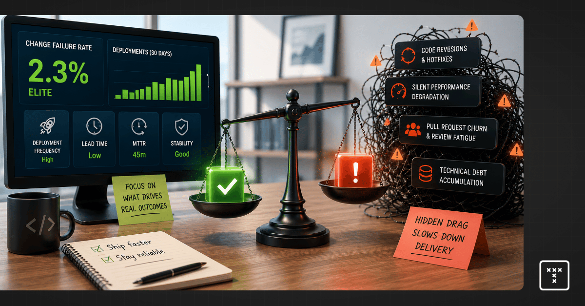
Change failure rate (CFR) measures the percentage of code deployments that result in a failure in production. The goal is to track how often your team pushes code that requires immediate remediation.
This metric serves as a critical counterbalance to deployment frequency. Optimizing strictly for speed often damages quality, so tracking failures ensures your team maintains system stability while shipping features faster. Engineering leaders use this DORA change failure rate signal to balance the inevitable tradeoff between quality versus speed.
Calculating this metric requires standardizing what counts as a deployment and what counts as a failure. You must define these terms consistently across your incident response tools and code repositories.
To calculate change failure rate, use this formula:
(Number of Failed Changes / Total Number of Changes) × 100
Industry benchmarks categorize engineering teams into performance tiers based on their ability to ship code reliably. According to the 2023 Accelerate State of DevOps Report by Google Cloud, you can measure change failure rate against these established standards to gauge your baseline delivery health.
Most engineering leaders limit the definition of failure strictly to hotfixes and rollbacks. This narrow scope misses the broader picture of system degradation.
If a deployment introduces massive technical debt or causes degraded service that doesn't trigger a critical alert, your dashboard will still show a success. This forces leaders to rely on intuition because incomplete data undermines the credibility of engineering reporting. Redefining failure for the modern era means looking at the entire workflow rather than just the final production state to capture the true cost of service patches.
Modern software delivery systems experience friction long before a catastrophic outage occurs. You must expand your definition of failure to capture the hidden costs of code delivery.
A dashboard can easily show an Elite status while your team is actually dealing with high pull request churn. This happens when teams game the metric or pollute the data with inconsistent definitions.
One common mistake is including fix-only deployments in the denominator of your calculation. If you push five hotfixes to resolve a single incident, counting those fixes as new deployments artificially lowers your failure rate. Another pitfall involves poor incident attribution, where third-party cloud outages are counted against internal team performance. These practices create a false sense of stability that operational intelligence must correct to restore trust in your reporting.
Executives must ensure their teams map incidents accurately across the software delivery lifecycle. Messy data makes it impossible to identify root causes and delays critical decision-making.
The rapid adoption of AI coding tools fundamentally changes how we measure delivery risk. These tools drastically increase developer output, so teams write and submit code faster than ever before. Yet this sheer volume of artificial intelligence-generated code contributions introduces unseen complexity into your repositories.
Downstream reviewers simply can't keep up with the flood of new pull requests. This imbalance creates severe review fatigue, where engineers lose the capacity to deeply inspect code for architectural flaws or long-term maintainability issues. The code compiles and passes basic tests, but the underlying structural health of the system degrades quietly.
Unmanaged complexity builds up in your repositories and creates massive workflow friction during the review stage. When a dense, highly complex pull request sits in review for days, engineers eventually rubber-stamp the approval just to clear their queues.
That code merges, sits in the pipeline, and fails days later in production. You then spend valuable engineering cycles on bug prioritization instead of shipping new features. The failure looks like a sudden event on your dashboard, but the root cause was the hidden complexity that bottlenecked your workflow days earlier.
Measuring a failure after it hits production is fundamentally a lagging indicator. Industry frameworks provide useful signals about your software delivery performance, but they don't provide an understanding of why that performance is changing. You need to know where risk enters your system before the code ships to production.
TargetBoard is an agentic operational intelligence platform that helps leadership teams understand how execution is performing, why it's changing, and how to respond. It connects data across company systems, interprets performance through operational intelligence, and uses domain-expert artificial intelligence agents to guide execution decisions.
By surfacing hidden risks like review fatigue, code anomalies, and workflow bottlenecks during the actual code review process, TargetBoard allows you to neutralize the root causes of failure before they merge. This shifts your posture from reactive reporting to proactive delivery confidence, ultimately driving true engineering efficiency.
You can actively prevent production failures by changing how your team handles code before it reaches the main branch. Aligned with the foundational Continuous Delivery principles established by industry experts like Jez Humble and Martin Fowler, shifting quality checks left is critical.
Pushing for speed without guardrails creates severe systemic tradeoffs. You must balance how fast you ship with how well your system actually runs.
Requires connecting cross-system data to accurately predict where failures will occur.
Redefining failure requires you to look beyond standard production deployments and measure the friction happening inside your daily workflows.
Your dashboard is only as valuable as the decisions it enables. Passive metrics show you what broke, so you must adopt active operational intelligence to see why it broke. Understanding these patterns gives you a clear framework to improve engineering efficiency and ensure long-term delivery predictability. Moving away from lagging scorecards allows you to scale your software delivery performance safely and build trust with your board.

.webp)